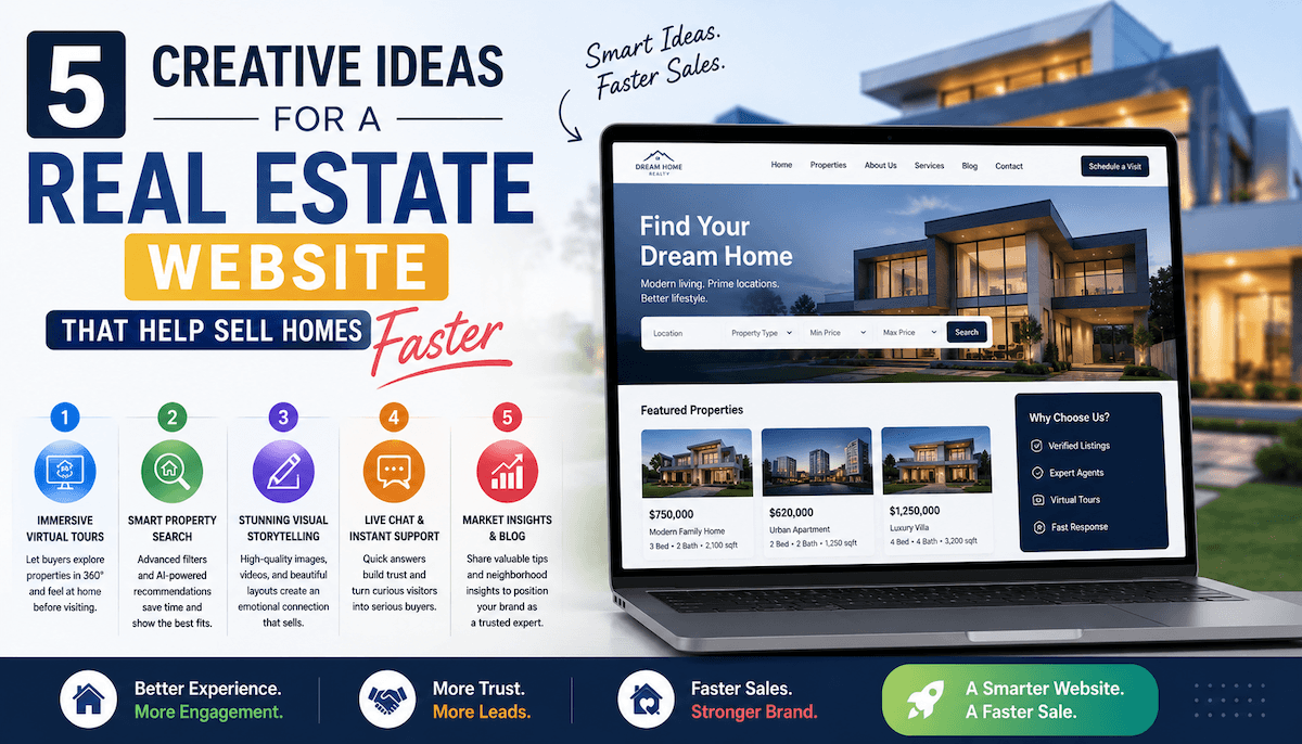
5 Creative Ideas for a Real Estate Website That Help Sell Homes Faster
Buying an apartment is one of the biggest decisions a person makes. Before calling a sales manager or visiting a showroom, most buyers spend hours on a developer’s website — studying floor plans, exploring the neighborhood, imagining their future life. In a competitive market, a site with a few renders and a contact form is no longer enough to hold their attention.
At DVIGA, a real estate website development agency, we have analyzed dozens of residential complex websites and identified the ideas that genuinely help developers sell faster. Here are five of them.
1. Show the View at Different Times of Day
A panoramic view is one of the strongest selling points for any residential project — but a single static image barely scratches the surface. Some developers now let users switch between morning, afternoon, evening, and night views directly on the homepage. The feature is simple to build, but the effect is powerful: visitors linger, imagine their mornings with coffee by the window, and feel emotionally connected to a project they have never visited in person.
For high-rise developments where the view is a core part of the value proposition, this kind of interaction can replace pages of descriptive copy.
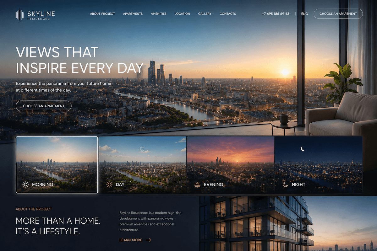
Source: Image created by ChatGPT (OpenAI)
2. Build an Interactive Neighborhood Map That Actually Tells a Story
Buyers don’t just choose an apartment — they choose a neighborhood, a daily commute, a school for their children. Most real estate sites drop a standard Google Maps pin and call it done. The more effective approach is to build an experience around location.
One strong pattern is a concentric-circle diagram centered on the complex, showing what’s within 10, 20, and 30 minutes on foot. Another is a filterable map where users can toggle between categories: schools, parks, cafés, gyms, transit. When infrastructure is shown this way, it stops being a checklist and becomes a picture of a life — which is exactly what a buyer is trying to evaluate.
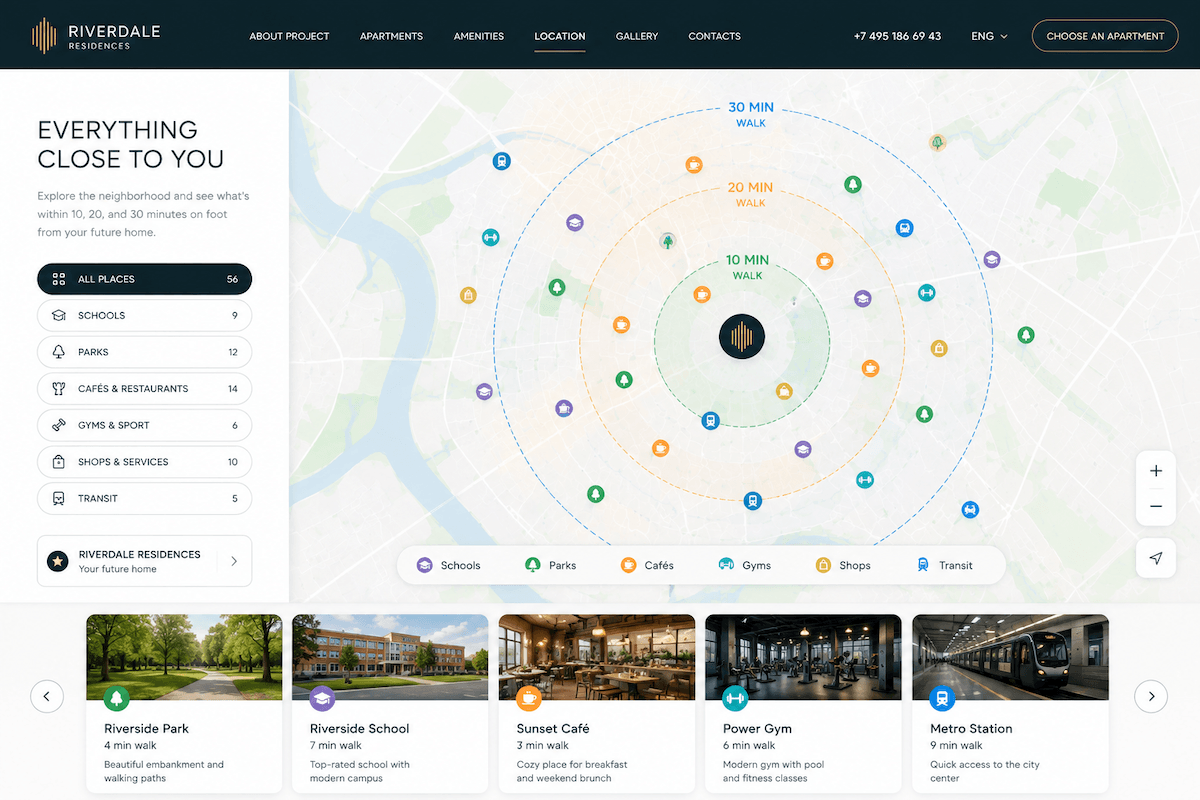
Source: Image created by ChatGPT (OpenAI)
3. Make Floor Plans Worth Exploring
A floor plan is often the most-visited section of a real estate site and the most underdesigned. There are three levels of ambition here, and each one outperforms a plain blueprint.
A little more than a drawing. The easiest upgrade is to add short annotations to the floor plan image: “walk-in closet,” “south-facing loggia,” “quiet bedroom away from the street.” Some developers go further and label plans by lifestyle — “for a young couple,” “for a family with two kids” — which helps buyers self-select quickly without reading long descriptions.
Almost like a game. A step up is a 3D floor plan where buyers choose a building, then a floor, then an apartment — one step at a time. This layered interaction reduces cognitive load and makes the search feel exploratory rather than transactional.
Build your own. The most ambitious version is a floor plan configurator that lets users combine layouts from a set of templates. This creates genuine engagement: buyers spend 20–30 minutes on the site playing with options, and by the time they contact sales, they already know exactly what they want.
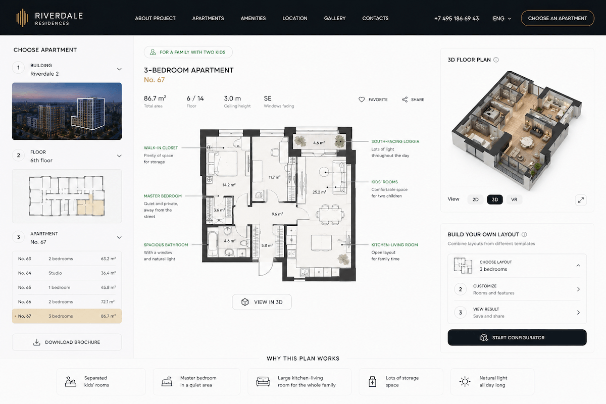
Source: Image created by ChatGPT (OpenAI)
4. Let Visitors Walk the Territory Before It Exists
For projects under construction, the gap between a render and reality is a real psychological barrier. A 3D interactive model of the complex — buildings, landscaping, communal spaces — helps buyers visualize scale and quality in a way that flat images cannot.
Virtual tours take this further. When a user can walk through a courtyard, look out from a balcony on the 12th floor, or step into a lobby, the property starts to feel real. This is especially valuable for buyers relocating from another city who cannot visit in person. Projects that offer virtual tours consistently report more qualified leads coming into the sales funnel.
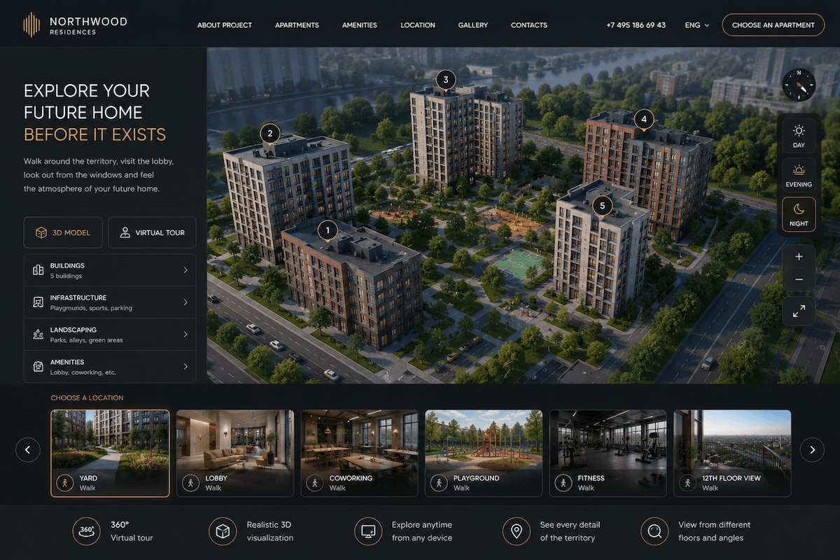
Source: Image created by ChatGPT (OpenAI)
5. Write Copy That Sounds Like Someone Actually Lives There
Most real estate copy describes the same things in the same way: “convenient location,” “quality finishes,” “developed infrastructure.” None of it sticks. The sites that stand out are the ones where the words match the identity of the project and speak directly to a specific kind of person.
A project aimed at young urban professionals can use a different register than one aimed at families. A waterfront development can build its whole narrative around the relationship with the sea. A complex in a historically rich neighborhood can lean into the stories of the place. When the copy reflects a genuine point of view, it builds brand identity — and brand identity is what separates a developer from the competition when prices are similar.
The key is to start with a clear picture of who the buyer is, and let that shape every word on the site.
Final Thoughts
These five elements share a common logic: they reduce friction, build emotional connection, and give buyers the confidence to take the next step. A real estate website does not need all five at once — but each one moves the needle on engagement and conversion. In a market where buyers are cautious and choices are many, the developer whose site makes the decision easier wins.