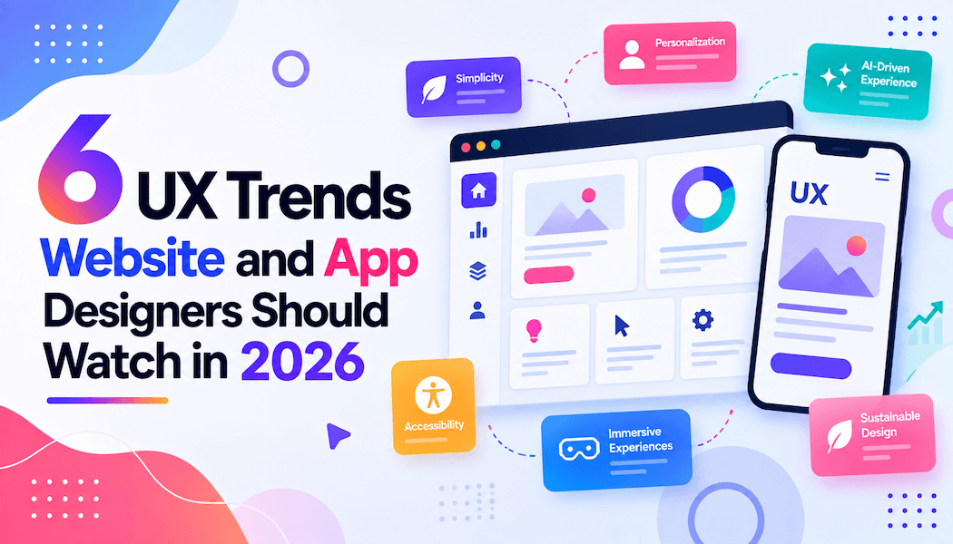
6 UX Trends Website and App Designers Should Watch in 2026
User experience design keeps changing as new technology gives designers fresh ways to help people find, use and enjoy digital products. Teams that ignore these changes often end up with interfaces that feel dated within a year, frustrating users who expect faster alternatives elsewhere.
Several trends stand out for designers working on websites and apps in 2026, from how people search with their voice to how much thought goes into making a product usable for someone with limited mobility. Knowing which deserve real investment will shape how well a product performs once real users get hold of it.
Voice search and hands-free navigation move into the mainstream
More people now search and move through apps by speaking rather than typing, especially on mobile and in the car. Voice Technologies builds speech recognition into search bars, menus and hands-free controls, letting a spoken phrase carry someone straight to the right screen. Large broadcasters are investing here too, with the BBC training its own in-house voice assistant to understand different regional accents.
Personalisation based on real behaviour, not broad assumptions
Interfaces increasingly adapt to what someone has clicked, bought or ignored, rather than broad guesses about age or location. Apps that track genuine behaviour, then quietly adjust menus and recommendations, tend to hold attention longer because the experience feels tailored. Getting this right means asking for no more personal data than the product needs.
Purposeful micro-interactions replace decorative animation
Small cues, like a button that visibly confirms a tap or a colour change when a field fills in correctly, build more trust than a flashy transition ever did. Designers are moving away from animation for visual flair and toward feedback that tells someone their action worked or needs fixing. Done well, these details cut the guesswork that makes people abandon a checkout halfway through.
Accessibility gets built in from the start, not bolted on afterwards
Screen reader support, keyboard navigation and colour contrast are no longer a final checklist before launch, since fixing them afterwards is slower and produces weaker results. Good accessibility treats vision, hearing, motor control and cognitive needs as one connected picture rather than separate fixes, changing decisions much earlier, from font choice to button labels.
Simplified, content-first layouts cut through digital clutter
Cluttered menus and competing calls to action push people toward the exit faster than almost anything else on a page. Teams are stripping navigation back to the handful of actions that matter, hiding secondary options behind one well-labelled menu instead of spreading everything across the top. Deciding what to leave out is the harder call.
Continuity across devices becomes a baseline expectation
People now start a task on a phone, continue on a laptop and finish on a tablet without thinking twice, so a broken handoff between devices reads as a fault rather than a minor inconvenience. Designers are syncing progress and preferences across devices, so switching screens doesn't mean starting from scratch, which takes closer coordination between backend teams and designers than most organisations are used to.
None of these trends work well in isolation, and adopting all six at once usually produces a messier product than picking two or three that suit a specific audience and doing them properly. The teams that gain the most this year will test these ideas against real user behaviour rather than copy a competitor's latest launch.