
Chatbot UI Design: 7 Examples and Best Practices
Chatbot UI design used to be a simple job. Pick a brand colour, put a round button in the bottom-right corner, and open a small window when someone clicks it. Job done.
Most web based chatbot UI design still starts there. But the big brands are moving their AI chat out of the corner and into the page itself: into search bars, headers, and full-height side panels.
I build AI chatbots for websites full-time, mostly for Australian online stores, so I spend a lot of time poking around other people's chat windows.
For this post, I opened the chat on seven big brand sites, on a laptop and on a phone, and measured each one: where the button sits, how big the window is, and what you see before you can ask anything. Here's what they do, the numbers, and what I'd steal.
7 Chatbot Design Examples from Big Brands
These run from the classic corner bubble to chat that lives in the page.
1. Australia Post: the classic corner bubble
Australia Post uses the classic layout: a 56px round red button, 45px in from the right edge. Click it and the AusPost Virtual Assistant opens in a 320 × 480px window, the smallest of the seven. The problem is what fills it. The first thing you read is a paragraph about recordings, AI training, and the privacy policy, long enough to need its own scroll bar. The first screen is the most valuable space in a chat window. Don't spend it on legal text.
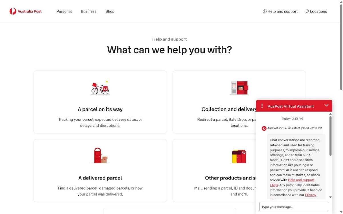
Image credit: Australia Post
2. H&M: plain, and honest about what it can't do
H&M's AI Assistant sits behind a 60px square button, a nice change from all the circles. The 375 × 570px window is as plain as the brand: black text, white background, and 4px corners. What I like is the first message. It says what the assistant can help with (customer service questions and order updates), then what it can't: it has no access to your account or membership. Telling people the limits up front saves a lot of frustrated messages later.
Image credit: H&M
3. IKEA: a bubble, a gate, then a menu
IKEA's round 56px button opens a yellow-and-white window, about 400 × 675px once the chat starts. It doesn't start straight away, though. First you get an AI notice and a "Start chat" button. Then Billie the bot says G'day, runs a Black Friday ad, and shows nine buttons: IKEA Family, Payment Query, Track Order, Start a Return, and five more. Nine is too many. Quick-reply buttons work when there are three or four of them. Past that, they're a phone menu with extra steps.

Image credit: IKEA
4. LEGO: chat as a section of the page
On LEGO's service page, Sophia gets her own big green section with a minifigure and a "Chat with Sophia" button. That's chat built into the page, which suits a help page where chat is the main event. Then the window opens (420 × 585px, 16px corners) and covers Sophia with an "AI Terms and Conditions" box you have to accept before you can type. The brand work is great. The gate undoes it.
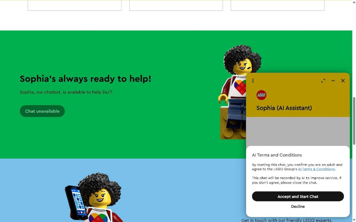
Image credit: LEGO
5. Woolworths: an "Ask anything" box in the page
Woolworths' help page is the clearest sign of where chat is heading. The top of the page is a big "Ask anything" box marked "AI beta", with six real questions underneath, like "How do I get a refund?". It looks like a search bar, and that's the point: everyone knows how to use one. Olive, the digital assistant, still lives on the side of the screen as a vertical "Chat with Olive" tab. It opens a 375 × 700px window with three quick replies and a mic button. The "Ask anything" box is the one I'd copy.
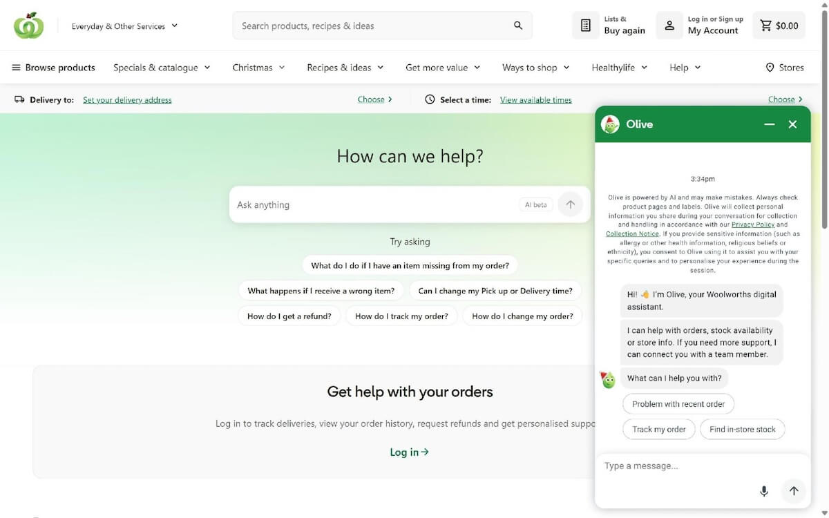
Image credit: Woolworths
6. Lowe's: a full-height side panel
Lowe's goes further. Click "Ask Mylow" and a 512px-wide panel slides in and runs the full height of the screen. There's room for big tiles: upload a photo of the problem, or talk to it with your voice. That's the right size for an assistant that helps plan a whole project, not just answer one question. The miss: a "Sign in or create an account" box eats a big chunk of the first screen.
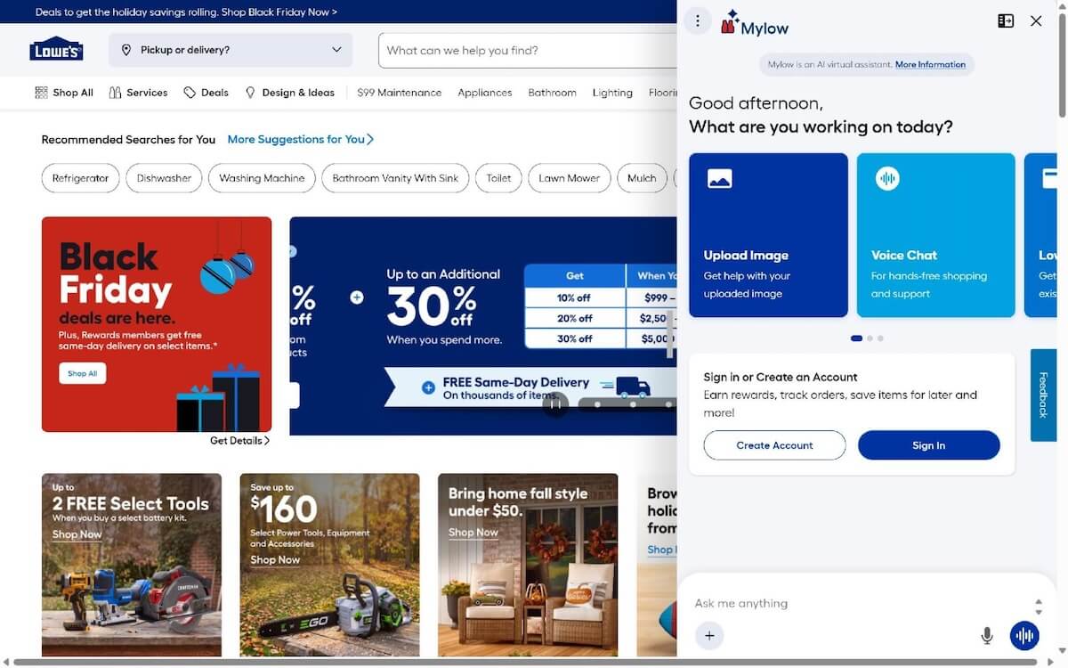
Image credit: Lowe's
7. Sephora: AI chat in the main header
Sephora has put "AI Beauty Chat" in its main header, right next to the search bar, with a NEW tag. That's the strongest placement of the seven, because it's where people look first, on every page. The chat itself is nice and has all the bells and whistles. Putting chat in the header tells shoppers it matters.
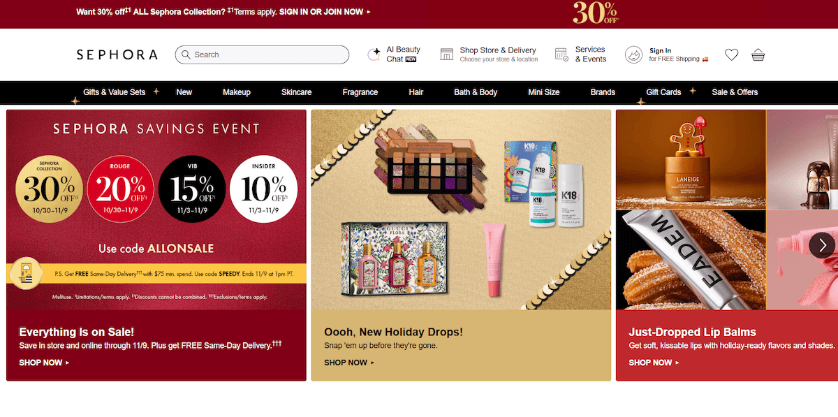
Image credit: >Sephora
Chatbot window sizes: what the big brands use
The chatbot window design of all seven, measured on a 1,440 × 900 laptop screen and a 390 × 844 phone.
|
Site |
Chat button |
Gap from the corner |
Window (width × height) |
Corners |
On a phone |
|
Australia Post |
56px circle |
45px right, 25px bottom |
320 × 480px |
8px |
Didn't open in my test |
|
H&M |
60px square |
40px right, 20px bottom |
375 × 570px |
4px |
Full screen |
|
IKEA |
56px circle |
63px right, 48px bottom |
About 400 × 675px |
10px |
Almost full screen |
|
LEGO |
225 × 48px button in the page |
In the page |
420 × 585px |
16px |
Full screen |
|
Woolworths |
36 × 135px side tab |
15px right |
375 × 700px |
16px |
Full screen |
|
Lowe's |
66px button |
20px right, 46px bottom |
512px × full height |
10px |
Full screen |
|
Sephora |
Text button in the header |
In the header |
Sign-in box |
None |
Sign-in box |
Two things stand out. On a laptop, the corner windows sit between 375px and 420px wide, and the newer designs break out of the corner altogether. On a phone, every chat that opened went full screen or close to it. The small floating window is a desktop thing.
Chatbot UI design best practices
These come from building chat agents for online stores.
Put the chat button where people look
The corner bubble still works because everyone knows what it is. Make it 56 to 64px and keep it at least 20px off the edges. On a phone, check it doesn't sit on top of the cart button, a cookie bar, or a "back to top" arrow. If chat is a big part of the site, give it a spot in the page or the header like Woolworths and Sephora do. Just don't lock it behind a login.
Make the first message do the work
One line to say hello, one line on what it can help with, then a question. Legal text gets one short line with a link: "AI can make mistakes. See our privacy policy."
Use three or four quick-reply buttons
Pick the questions people actually ask and keep the labels short. Better still, match them to the page. On a product page, "Is this in stock in my size?" beats "Payment query" every time.
Show products as cards, not text
In a store chat, the answer is often a product. Show it as a card with a picture, the name, the price, and whether it's in stock. People tap cards and skim past text links. Here's how I lay it out on a demo store: three items as compact cards, the total underneath, and two quick replies for the next step. Tap a card and it opens to show Add to cart and View on site buttons.
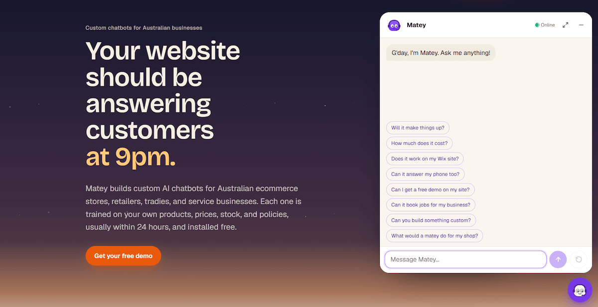
Image credit: author's own, a Matey
Go full screen on phones
Keep the text box above the keyboard, put a big close button in the top-right corner, and set the text box to at least 16px, or iPhones zoom in when you tap it.
Show it's working
Show typing dots the moment someone sends a message. If an answer takes more than a few seconds, say what's happening, like "Checking stock…". A chat window that sits there blank feels broken.
Make handing over to a human obvious
Woolworths gets this right in Olive's second message: "I can connect you with a team member." Say when real people are around, pass the conversation over so the customer doesn't have to repeat themselves, and if nobody's on, take an email address and say when they'll hear back.
The corner bubble isn't dead, but good chatbot interface design isn't only about the bubble any more. Whatever you choose, test it the same way: open it on your phone and count how long it takes to ask your first question.