
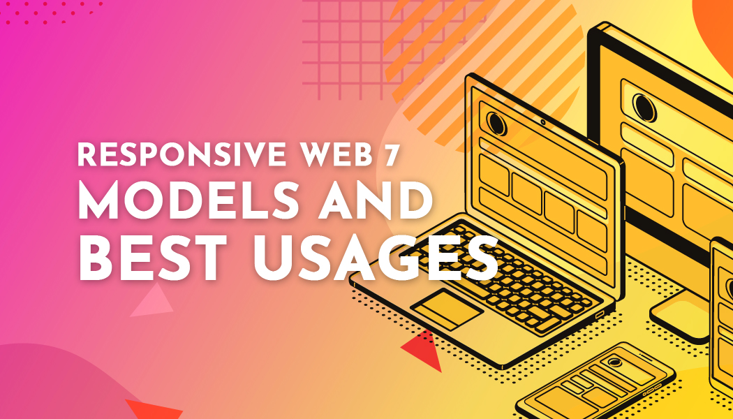
Responsive Web 7 Models and Best Usages
The framework of responsive web design is popular in the contemporary digital world. It is because these frameworks make it easier, creating a single website that correctly fits into all devices regardless of the size of their screens. That means one site can be used in various methods like mobile phones, laptops, and desktops. Responsive web design can be said to be the overall approach in building websites that comprises specification standards and flexible models. It has both tools and structures that focus on the content and layout of a business platform. Many people go for responsive web design services because its designing process inputs different features like menus and another required model.
1. Bootstrap
It was initially launched as a framework for supporting consistency in all internal tools. Before its launch, bootstrap, different libraries were used in developing interfaces, and due to the increased numbers, it lost its aspect of consistency. It is free, open-source that has a 2-column grid in its system's layout. It is used in building responsive yet mobile-first projects for the platform. It consists of several features inclusive of:
- Easily customizable
- Easy to use
- Sensitive for the utility classes
- A well-structured grid system
- It has components like buttons, navigation, badges, and progress bar, among others.
2. Simple
It is a very light-responsive open-source framework that is used to design flat and clean websites. It requires SASS when building to make an excellent basis for creating websites. It offers a 12-column with a flexible gridding system that can be used in building responsive site pages. These website pages can be viewed in types of devices, regardless of the screen size. Besides, simple comes with a beautiful, modern, yet simple design. It can be used in the intuitive classes to style the elements of your sit. The following are some of its features:
- Its design is flat and clean
- Small size
- It offers a seamless user experience
- Best choice for the beginners
- Responsive
- Modular
3. Material UI
This is a designing language that was developed by Google back in 204. It uses the grid-based layouts, animation, padding, transitions, and the depth effects in the likes of lighting and shadows. Its front-end and framework uses Google's material designed feature to function. Its library cannot work with the web0-based projects because it is a CSS pre-processor that aims at implementing the reactive components that are famous for its customizable tools. It mostly focuses on the mobile market since it offers it with a wide range of styles, parts, and customizable design tools available in the developing platforms. Below are its features
- Responsiveness
- Mobile-friendly
- The custom style prop up
- Theming
- Customizable tools
- Interoperability
4. Semantic UI
It helps in building user-friendly responsive websites that have semantic UI. Its words and classes are usually created in a manner that they are treatable, and its concepts are easily exchangeable. The levels make up the syntax basing from the natural language like the nouns and their modifier relationships, plurality, order of words to easily link up concepts intuitively. Also, it uses simple phrases that are known to refer to the behaviors that trigger the site’s functionality. All these decisions are made within the component that incorporates settings where the web developers should keep updating the websites.
The semantic UI has the following features:
- Many UI components
- Variable theming
- Simplified debugging
- Responsive
- It is mobile friendly
5. Foundation
It is an exceptional front-end model that has an ultra-responsive framework used in building websites, the application, and mobile templates. It is the simplest yet easiest to learn hence can be used by a new user. It has several components inclusive of the navigation, layout, library containers, and many others. It has several plug-ins that give an extensive choice. The website developers make it they are favorite. Below are some of its features:
- Semantic
- Mobile-friendly
- Good documentation
- Customizable
- Business support
- Training
- Offers consultation to help in the improvement of its products and services
6. Pure
It is an exciting choice that helps in accomplishing web projects. It has tiny footprints because it has a small set of CSS. With time it has been developing having the mobile in mind to add the minimal style so that it can accommodate the platform in a device. It helps the website developers in writing various forms on the application in accordance with the requirements. Its extensive CSS has made available with pure hence an impressive customer leading to the creation of a site of their choice. It has the following features:
- Grids and layout
- Minimal yet flat design
- Menu, forms, and button
- Tools
- Responsiveness
- Mobile-ready
7. Skeleton
Although it is a small responsive model, it helps in the website development process of a business platform. Due to its lightweight, it helps in building sites for mobile devices, tablets, desktops, and other devices without comprising the quality of the platform. Its feature helps in contributing to decreasing the time of developing a site. These features are UI, forms, buttons, foundation, and other organized files.
Skeleton is the right choice for those working on smaller projects that do not require the utility of ideal frameworks. It is usually defined as a boilerplate or lightweight as a result of its attributes.
Conclusion
The responsive designs are more of solving puzzles because it entails organizing the elements or rather features to enhance flexibility to a functioning model. Choosing the right one for your platform is an essential thing for every website. The many features that make up the above models help in building outstanding website designs for your company. Ensure to incorporate the entire responsive designs hen optimizing your web so that it is possible to use them in various devices. By following that and all other procedures, your platform will display well on the tools that you use.