
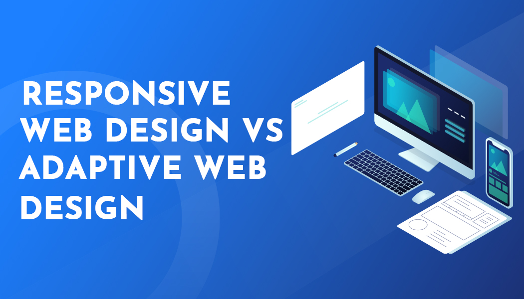
Responsive Web Design vs Adaptive Web Design
A web design today would have to accommodate big desktop monitors as well as small-sized phones. The answer lies in responsive and adaptive web design. They are both geared towards providing an optimal user experience across all devices, but they do so in different ways.
We will explore the differences between them and when one might be preferred over the other.
What is Responsive Web Design?
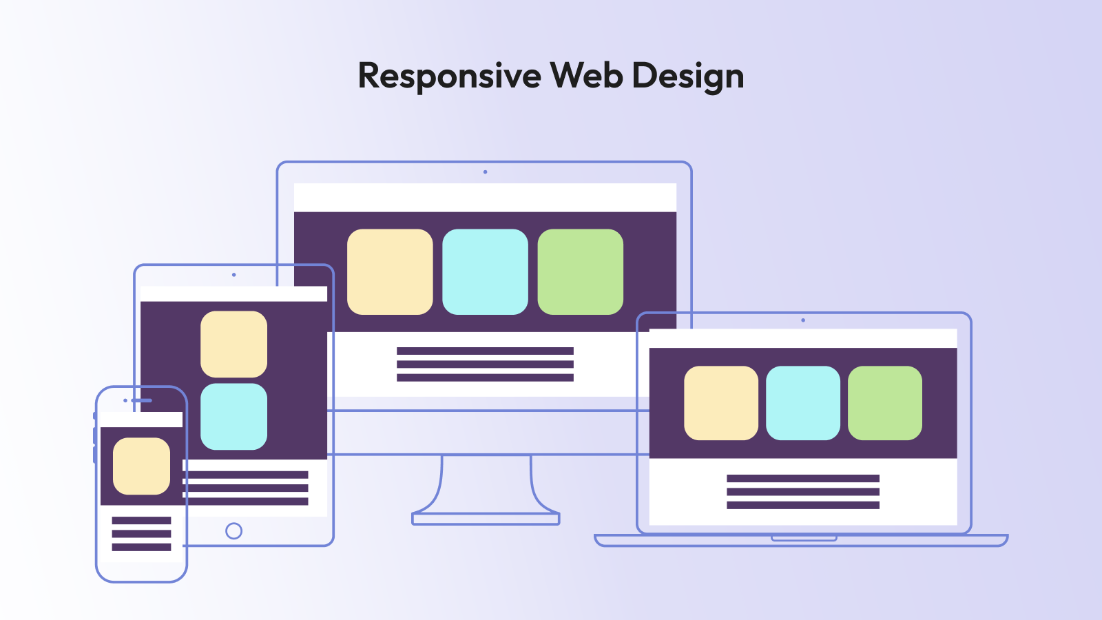
With responsive web design, the layout is utilized once and is subsequently customized to accommodate all different display dimensions. Consider fluid. The contents follow the images to adjust, and the grids change with automation.
As you resize a responsive website in a web browser, all the various elements on the webpage adapt smoothly. On smaller screens, columns stack vertically, fonts scale down, and menus are often scaled down to a hamburger menu.
The retailer should use responsive design on its website so customers would not need to download an application to purchase goods on the desktop, tablet, or phone. All the experiences are based on the same HTML and CSS, keeping maintenance uncomplicated.
CSS media queries allow this to happen. Developers would use breakpoints- i.e., 768px on tablets or 1024px on small laptops. Every breakpoint is adjusted in the layout so that it is convenient to use.
What is Adaptive Web Design?
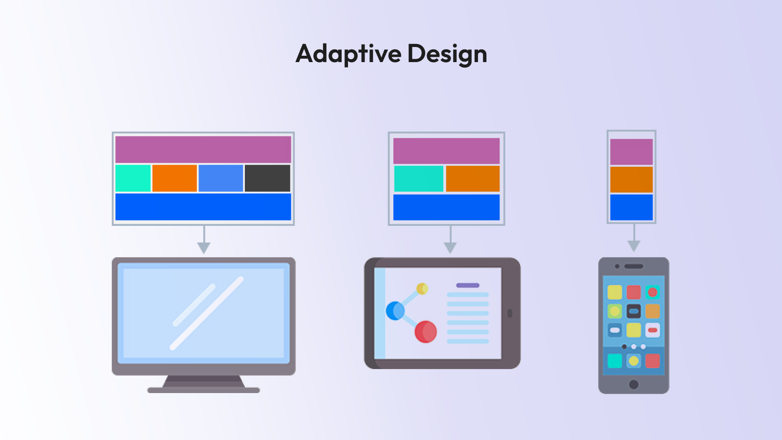
When dealing with adaptive web design, however, multiple setups are created to achieve a consistent design across various screen sizes. Do think of separate blueprints of phones, tablets, and desktops.
And instead of smoothly transforming the layout at every pixel, an adaptive website will automatically detect the device and display the layout that best fits it. A phone layout is sent to an individual if they appear on a phone. They are presented with the desktop on a big screen.
Adaptive design is typically used on hotel or airline booking websites. They want to have high control of the behavior of an interface on varied devices. A mobile design may be optimized with quick-book buttons and date pickers, and the desktop design may feature side-by-side calendars, maps and feature-rich filters.
Adaptive design usually involves a group of code or templates of different sizes of screens. Although that may be more complicated, it allows the designer to wield greater control and thus provide very customized experiences.
Major Differences
The key and brief difference you’ll need to remember is:
Responsive design = flexible and fluid
Adaptive design = fixed layouts, plural
Responsive means you only have one site that reacts everywhere. In an adaptive approach, you create different versions of the same on the varied screen sizes. As you reduce the size of your browser window on a responsive site, you use gradual transitions. An adaptive site causes jumping between drastic changes where a design layout changes.
Pros of Responsive Design
Simplicity and easy maintainability are often best achieved by responsive design. As you are operating with a single set of code, it is possible to make updates in one location.
A news website can incorporate a responsive design, allowing stories to be readable on every device. Whether it is on an iPhone or Android tablet or a huge iMac, you get the same experience.
With responsive design, SEO is not demanding. It is also recommended by Google since all you need is a single URL by each device type and there is no duplicate content issue.
Optimization can be achieved through responsive images, CSS elements, and modern systems. Responsive design web development costs are moee reasonable, when it comes to businesses operating under a shoestring budget because it all needs is a single code that can serve a variety of devices.
Pros of Adaptive Design
Adaptive design is ideal when you need total control as to how your site needs to look on different devices.
The site of an online banking application can be taken as a reference point. On a smart phone, you need large keys and fast authentication. On desktop, you can provide detailed-account information, charts, and advanced tools. Adaptive design ensures that each variation is custom-designed.
Furthermore, the performance may also be enhanced because one can provide what is desired. The design has the capability to exclude bulky desktop resources, thereby resulting in faster loading in mobile users.
In some cases, businesses are driven toward adaptive designs with the help of their legacy systems. If you have a desktop site but are interested in adding a mobile site, you can create that component independently, and then you don't have to rebuild the entire site.
When to Use Responsive Design
The responsive design will work on most websites today. Blogs, professional sites, portfolios, small business pages, web shops, or web-based magazines often opt for it.
To ensure consistent branding across devices and a sustainable codebase, responsiveness is very hard to beat.
Services such as Tailwind and Bootstrap let you do minimal work to have a responsive design. They provide ready-to-use grid systems and elements that automatically respond to different screen scales.
When to Go Adaptive
Adaptive design is useful when accuracy and control are required. Giant-sized businesses capable of supporting multiple layouts opt to choose adaptive design as a way to meet the specific needs of different devices.
One can even support complex user flows in web applications. eLearning: The web-based eLearning application may offer rich desktop dashboards, but may be limited in features such as quizzes and videos on smartphones.
Adaptive is also effective when the application involves a high level of usability. Adaptive design is also common in healthcare portals, airline booking systems, and banking websites, providing a close customisation of the experience.
Conclusion
Both responsive and adaptive web design are the keys to presenting high-quality user experiences on any device.
Responsive design makes it convenient and flexible in maintenance. Adaptive design presents accuracy and customized designs.
There is nothing like a best answer. An optimum solution will be different, depending on your end-users, your objectives, and your resources.
Next time you plan a sit,e take a long and deep look at how your end-users will interact with the site. A correct selection of the format of design strategy can be between a site that pleases everyone on any display and a site that sends people running.