
The UX Frameworks Behind Today’s Most Engaging Web and Mobile Experiences
The average user interacts with digital interfaces thousands of times a day. Yet, we rarely notice the architecture guiding our fingers. We only notice the friction when a button is too small, a navigation menu is confusing, or a checkout process requires entirely too many steps.
The most engaging web and mobile experiences are not built on flashy graphics or trendy color palettes. They are built on invisible, highly psychological UX frameworks. These structural blueprints dictate exactly how a user absorbs information, makes decisions, and ultimately takes action.
By examining the underlying mechanics of these successful digital environments, designers can stop guessing what users want and start building exactly what human behavior demands.
Atomic Design: Building Systems Instead of Pages
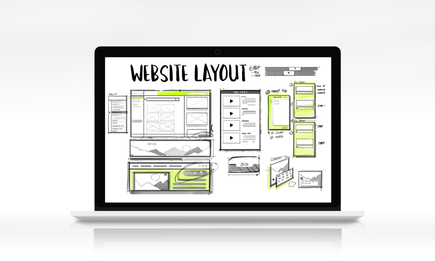
Historically, web design was a highly subjective process. Teams would endlessly debate aesthetics like typography, texture, and color palettes because everyone brought their own unique perspective to the table. Legacy design systems often exacerbated this issue by simply cherry-picking patterns after a page was already built. Web designer Brad Frost realized that to build scalable interfaces, teams needed to stop looking at the finished page and start looking at the microscopic building blocks.
Inspired by basic chemistry, Frost introduced the Atomic Design methodology. The premise is brilliantly simple. All matter is comprised of atoms. When applied to digital interfaces, an atom is the smallest possible HTML element.
A single form label, a text input field, or a submit button are all individual atoms. On their own, they are basic. When bonded together, they form functional molecules. For example, combining that label, input field, and button creates a complete search bar molecule.
These molecules then combine to form complex organisms, which build templates, which finally result in a complete page. Frost argues that the page stage is crucial because it acts as the ultimate stress test for the entire system. If the final page looks disjointed, the flaw lies within the underlying atomic structure, not just the surface aesthetics.
The true power of Atomic Design is how it completely bridges the gap between designers and developers. By establishing a shared naming convention, a developer coding in React can easily translate visual atoms into highly consistent, repeatable JavaScript components. This disassembly simplifies complicated elements and ensures a solid architecture. It allows new developers to jump into a project, understand the structure instantly, and scale the user interface without the code devolving into chaos.
The Hook Model: Engineering Digital Habits
We all have applications we open subconsciously. You unlock your phone to check the weather, and suddenly, you are ten minutes deep into a social media feed without any memory of tapping the icon. That behavior is not an accident. It is the direct result of a highly engineered UX framework known as the Hook Model.
Developed by behavioral designer Nir Eyal, this methodology explains how digital products transition from being a simple tool to becoming an unconscious habit. The framework relies on a continuous four-phase loop designed to manufacture desire and retain users without relying on constant marketing.
The Trigger
Every habit starts with a cue. Initially, products rely on external triggers to get your attention, such as a push notification, an email, or a targeted advertisement. However, the ultimate goal of a successful UX is to attach the product to an internal trigger. When a user feels a fleeting moment of boredom or stress and automatically opens an app to soothe that feeling, the interface has successfully mapped itself to a human emotion.
The Action
The action is the minimal behavior performed in anticipation of a reward. For the psychological loop to hold, this step must be entirely frictionless. Whether it is swiping right, double-tapping an image, or clicking a single play button, the action must require zero cognitive load. If a user has to navigate a clumsy menu or wait for a slow animation to complete, the habit is broken before it even begins.
The Variable Reward
This is the psychological engine of the entire framework. If an application delivers the exact same predictable experience every single time you open it, your brain quickly loses interest. We are biologically wired to crave novelty. By providing an unpredictable reward, whether it is an entertaining new video, a surprising social interaction, or the satisfying validation of checking off a digital task, the UX triggers a rush of dopamine. This variability is exactly what keeps the user scrolling to see what comes next.
The Investment
The final phase of the loop requires the user to put a small amount of work into the system. This could mean uploading a photo, curating a playlist, following a new account, or inputting personal preferences. This investment accomplishes two things. First, it gives the platform more data to customize the next trigger. Second, it makes the product inherently more valuable to the user, making it psychologically much harder for them to abandon the platform in the future.
Hick's Law: The Architecture of Choice
Imagine sitting down after a long week to watch a movie on a streaming platform. You are immediately presented with thousands of titles categorized by genre, trending status, and personalized recommendations. Instead of feeling liberated by the options, you spend twenty minutes scrolling before giving up completely.
This paralysis is known as Hick's Law. Formulated in the 1950s by psychologists William Edmund Hick and Ray Hyman, the principle dictates that the time it takes for a person to make a decision increases alongside the number and complexity of choices presented to them. When an interface overloads the brain with stimuli, the user experiences decision fatigue and abandons the task entirely.
For UX designers, combating this cognitive overload requires ruthless simplification. This does not mean removing necessary features or dumbing down the product. Instead, it involves breaking complex processes into highly digestible, sequential steps.
Consider the standard e-commerce checkout process. If an interface asks a user to input their shipping address, billing details, and promotional codes on a single chaotic page, the abandonment rate spikes. By separating these steps into individual screens with one clear call to action per page, giants like Amazon eliminate friction.
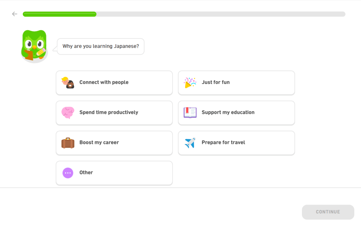
Similarly, educational platforms like Duolingo utilize progressive onboarding. Rather than dumping a new user into a complex dashboard, the interface guides them through a step-by-step tutorial, requiring one simple interaction at a time.
Of course, context always dictates the design. Highly technical software built for expert engineers or professionals will naturally require a dense interface with maximum control. However, for everyday consumer applications, the underlying rule remains absolute. If you want a user to take action, you must clear the visual clutter and make the choice as simple as possible.
Miller’s Law: The Architecture of Cognitive Load
While Hick’s Law focuses on the speed of decision making, Miller’s Law addresses the physical limits of human memory. Introduced by George A. Miller, the law states that the average person can only hold roughly seven (plus or minus two) items in their working memory at once. When a digital interface exceeds this limit, users experience "cognitive load", a mental tax that leads to frustration, missed details, and eventual abandonment.
To combat this, most designers utilize "chunking": the process of breaking complex information into small, manageable groups. By limiting primary navigation choices to the optimal five-to-nine range and organizing content to reflect how the brain naturally processes data, platforms ensure the user’s focus remains on their goal rather than the software itself.
The stakes of ignoring this law are highest in professional tools like Customer Relationship Management (CRM) platforms. Many CRMs have become so feature-dense they are nearly unusable, burying sales representatives under "walls of text" and cluttered data fields. When a tool is more complex than the task it’s meant to solve, it has failed its mission. Every minute a rep spends navigating a labyrinth of sub-menus is a minute stolen from closing deals.
The most effective digital environments, however, turn this "information dump" into a streamlined experience through strategic application of Miller's Law. Pipeline CRM's UX for example, leverages chunking to keep the sales process visual.
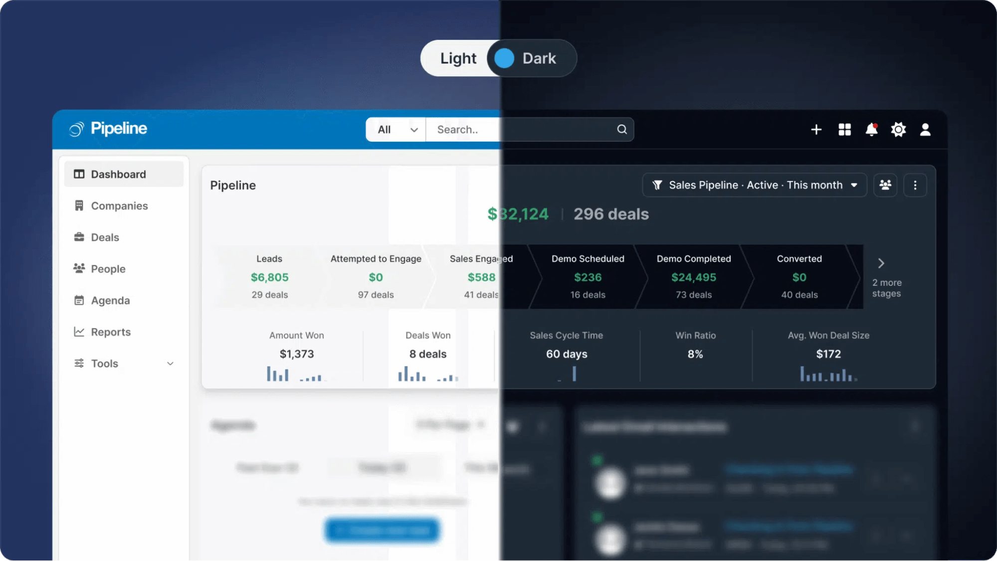
By grouping deals into distinct stages and using widgets for metrics like win ratios, the platform aligns with the user’s mental model, allowing teams to process high volumes of data without hitting a cognitive ceiling.
Canva is another example of a platform that revolutionized a complex industry by respecting these cognitive boundaries. Before Canva, graphic design was largely restricted to experts who could navigate the overwhelming, multi-layered interfaces of professional software.
Canva applied Miller’s Law by strictly limiting the number of top-level editing options and grouping assets into intuitive "chunks" like "Templates," "Elements," and "Uploads." By keeping the most essential tasks in focus and hiding advanced features behind progressive disclosure, they made high-end design accessible to the average user without the paralysis of choice.
Ultimately, professional power should not come at the cost of clarity. By respecting the limits of human memory, these platforms transform complex technical workflows into intuitive, high-performance experiences.
Jakob's Law: The Psychology of Familiarity
One of the most common mistakes designers make is trying to be entirely original to stand out. However, according to UX pioneer Jakob Nielsen, users spend the vast majority of their time on other websites. Because of this, they expect your interface to work exactly like the sites they already know.
This principle, formulated in 2000, is known as Jakob's Law. It dictates that a user's mental model of the web is built over years of repeated exposure to common design patterns. Any slight variations are ignored, while the commonalities become engraved in the user's brain.
Consider professional platforms built to handle massive amounts of client collaboration, such as the image management and photo-sharing platform PicDrop. When a creative agency sends a gallery of hundreds of photos to a corporate client, the interface must be instantly recognizable.
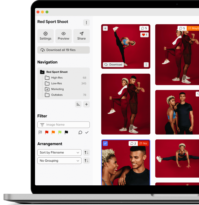
This platform leverages Jakob's Law flawlessly by utilizing a deeply familiar structural hierarchy. The left side navigation cleanly organizes folders and filters, while the central dashboard displays visual assets in a clean grid.
Icons for downloading and sharing are positioned exactly where decades of software usage have trained our brains to look for them. Because the layout matches what users already expect from standard operating systems, they can focus entirely on reviewing images rather than learning a new tool.
This reliance on established conventions extends across the entire digital landscape. Whether a user is buying goods on Amazon or searching for a file in Google Workspace, they rely on these same ingrained expectations. They expect the shopping cart icon to be instantly recognizable, the search bar to be an open text box near the top right, and the scroll bar to simply move the page up and down without any unexpected animations.
If a design violates these expectations, usability immediately suffers. Nielsen warns that deviating from standard patterns, such as centering a logo instead of placing it in the upper left corner, can drastically increase navigation failures.
Another egregious violation is scrolljacking, where designers override native scrolling behavior to force custom animations, leaving users feeling completely disoriented. By sticking to the fundamental architecture of familiar environments, designers ensure their interface remains invisible and highly engaging.
The Competitive Advantage of UX
When product teams treat interface design as a psychological science rather than a subjective art project, they unlock a level of retention that standard marketing simply cannot achieve.
Software capabilities are no longer a sufficient moat. Features can be easily copied by competitors, and pricing can always be undercut. However, a deeply ingrained user habit and a completely frictionless workflow are incredibly difficult to replicate.
By prioritizing the invisible architecture that guides human behavior, brands can build intuitive environments that command long-term loyalty and transform passive visitors into permanent users.