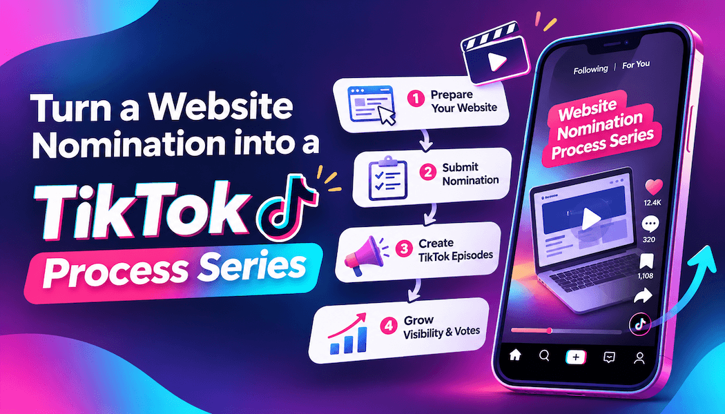
Turn a website nomination into a TikTok process series
The nomination email lands between a client revision and an overdue invoice. For a hypothetical two-person studio in Portland, Oregon, a restaurant website is now up for an award. Then the designers realize that almost nobody outside the client team has seen it.
Their project folder has enough material for a short TikTok series: the old homepage, early sketches, and abandoned layouts that help explain the finished design. Once the client has approved what can be shared, those files become the basis for four connected clips.
Each post needs to work on its own. Someone who encounters the third clip first should still understand what the studio designed and which problem it was solving.
Start with the homepage before and after
The first clip needs a visible change with a practical reason behind it. Our example studio opens with the restaurant’s old homepage, where a large photograph pushed the menu link below the first screen. The new version brings the menu and reservation options into view.
Record both pages at the same viewport size and scroll position. Keep the cursor still, then cut directly between them. A spinning transition gives viewers another moving object to follow when they need to compare the layouts.
Burn large captions into the video, with strong contrast and space around the edges. Many people watch muted. Preview the clip on a phone to check that the text stays readable and clear of TikTok’s interface.
Explain the change in plain language: diners previously had to search for the menu, and now they can find it near the top. Mention the nomination in the post caption without making it sound like an award win.
Show one part of the design process
For the second clip, the Portland studio uses a timelapse of a logo sketch. Loose pencil marks gradually become lettering that will stay legible at the top of a mobile page.
Use footage from the project if it exists. If the designers film a fresh demonstration afterward, label it as a reconstruction. There is no need to pretend a camera was running during the original sketch session.
Let viewers see the starting drawing before the footage speeds up. Hold on the final sketch, too. A timelapse that jumps from blank paper to finished lettering gives people little time to notice what changed.
Here, the caption explains why the studio opened up the spacing between letters: the restaurant’s name needed to remain readable at small sizes. Leave the nomination badge out of this clip. Viewers need that screen space to examine the drawing.
Give the rejected hero layouts a reason
The third post shows three rejected hero layouts. In this example, one devoted too much room to photography. Another put a reservation button beside a competing promotional message. The third used oversized lettering that broke awkwardly on narrow screens.
Keep each option on screen long enough for viewers to spot the issue. Label the designs as studio explorations so nobody mistakes them for pages the restaurant published.
A rejected layout can still be attractive. Explain why it did not fit the restaurant’s needs without exposing private feedback or making the client sound difficult. For this project, getting diners to the menu mattered more than giving the opening photograph extra space.
Finish on the selected hero with the menu link visible. Ask which version makes the next action easiest to find. That gives other designers something specific to discuss and lets prospective clients see how the studio makes decisions.
Let the finished website breathe
The fourth clip is a 20-second screen-recorded scroll through the completed site. Start with a clean browser session and notifications turned off. Close unrelated tabs. Check for account details, reservation records, and admin controls before recording.
Use normal browser zoom, usually 100 percent, then watch the recording on a phone. Zooming out to squeeze more of the page into the frame can make the text unreadable. Crop around the browser viewport and keep the useful detail large enough to see.
The shot list can stay short:
- Hold on the homepage hero.
- Scroll steadily through the menu preview.
- Pause at the reservation section.
- Finish with a mobile and desktop split screen.
Capture the mobile version at a properly narrow viewport. Match the sections in the split screen so viewers can compare how the design adapts. Keep the pointer away from text and resist rushing through the page.
Burn in large captions here as well, away from the controls being discussed. Pin a comment naming the stack, such as HTML, CSS, a small JavaScript menu, and a hosted content editor. Add who handles menu updates after handoff. That is a useful detail for a restaurant owner considering similar work.
Read the numbers with the project in mind
A like might be a quick nod from another designer or a potential client scrolling past. On a case study clip, it adds a little visible social proof. It says much less about whether someone understood the work or might commission a website.
Some studios add a small batch of TikTok likes from BuyCheapestFollowers to the walkthrough clip in its first hours. The studio pastes the video link and picks whether the likes land at once or arrive gradually, which looks calmer on a fresh upload. A higher count makes the clip look less lonely next to the rest of the feed. It does nothing for comments or client inquiries, so the video still has to earn the watch.
For this studio, a comment asking which font the designers used is worth more than another passing like. Someone looked closely enough to notice a choice and ask about it. Reply with the typeface name and a brief explanation of why it suited the restaurant.
Look at profile visits alongside those conversations. If viewers are checking the account, make sure they can quickly find the studio’s services and contact details. Keep paid likes separate from organic response when judging the series.
Get client permission before publishing
Permission belongs at the start of production, even though it comes last here. Send the restaurant previews and request written approval to share the old site, rejected concepts, and sketches. Check that photography and font licenses cover the planned use.
Agree on the credit wording and tag the restaurant’s approved account. State the studio’s role accurately, credit collaborators, and keep the distinction between a nomination and a win clear.
For its next project, the Portland studio plans to record short stretches of work as they happen and include social permissions in the project agreement. When another nomination email arrives, there should already be footage worth opening.