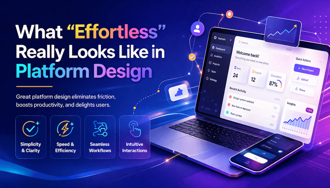
What “Effortless” Really Looks Like in Platform Design
“Effortless” is one of the most overused words in web and mobile app design. Every platform claims to be seamless, intuitive, or frictionless. Yet truly effortless design is rare, and when it does exist, it is often invisible.
Effortless design is not about minimal effort from the designer. It is about a minimal cognitive load for the user. It is the result of deliberate engineering, structured thinking, and continuous iteration.
For developers, designers, and anyone working in technology or digital products, understanding what effortless actually looks like is essential. It is not aesthetic. It is architectural.
Effortless Means Reducing Cognitive Load, Not Just Visual Clutter
The most common misconception is that effortless design equals minimal design. While simplicity is important, removing elements alone does not create a better experience.
True effortlessness comes from reducing cognitive load. That means:
- Fewer decisions
- Clearer pathways
- Predictable outcomes
Minimalist design principles support this by eliminating unnecessary elements and focusing on what helps users complete tasks. However, the goal is not to strip everything away. It is to ensure that every element that remains has a purpose.
An interface with too little information can be just as frustrating as one with too much. Effortless design sits in the middle, where users never have to stop and think, “What do I do next?”
Effortless Platforms Prioritize Immediate Action
The best platforms reduce the gap between intent and outcome.
Think about high-performing apps. When a user opens them, the next step is obvious. There is no exploration phase. No learning curve. The interface guides the user directly to action.
This is a core usability principle. Systems should allow users to achieve goals efficiently, with minimal time and effort.
In practice, this means:
- Primary actions are always visible
- Navigation is secondary, not dominant
- The interface responds instantly to input
A well-designed platform does not ask users to understand it. It adapts to how users already think.
Structure and Flow Matter More Than Features
Many platforms fail not because they lack features, but because they lack structure.
Effortless design depends on how information is organized. According to user interface principles, structure should group related elements, separate unrelated ones, and create clear mental models for users.
In web and mobile applications, this translates to:
- Logical progression from one step to the next
- Clear hierarchy of information
- Consistent placement of actions
When the structure is correct, users rarely notice it. When it is wrong, users feel lost almost immediately.
Effortless platforms are not feature-rich. They are flow-optimized.
Feedback Is What Makes an Interface Feel Alive
Effortless experiences are not silent. They communicate constantly.
Every interaction should produce feedback:
- A button responds visually
- A process shows progress
- A system confirms completion
This is where micro-interactions play a critical role. Small animations and feedback loops help users understand what is happening without needing instructions.
Without feedback, users hesitate. With it, they move confidently.
Effortless design removes uncertainty, and feedback is how that is achieved.
Real-World Platforms Show What Effortless Looks Like
The clearest way to understand effortless design is to look at platforms that execute it well.
Consider systems that solve real-world problems, not just digital ones. When a platform handles both user interaction and operational complexity, effortlessness becomes more challenging and more meaningful.
For example, platforms like Shiply simplify complex logistics into a clean digital workflow. A user looking for car transporters in Fort Worth does not need to understand routing, pricing models, or carrier networks.
Instead, the platform abstracts complexity through:
- Simple input flows
- Automated matching systems
- Clear progress tracking
From a technical perspective, this is not simple at all. It requires backend systems, real-time data handling, and algorithmic matching. From a user perspective, it feels effortless.
That contrast is the defining characteristic of great platform design.
Effortless Design Requires Invisible Complexity
One of the most important insights for developers is that effortless front-end experiences often rely on complex back-end systems.
Effortless design includes:
- API orchestration
- Data normalization
- Real-time updates
- Intelligent defaults
The user does not see any of this. They only see the result.
This is why effortless design cannot be achieved through UI alone. It requires collaboration between:
- UX designers
- Front-end developers
- Back-end engineers
- Data teams
The more complex the system behind the interface, the more important it is to hide that complexity effectively.
Effortless Does Not Mean Feature-Less
A common mistake in platform design is equating simplicity with limitation.
Effortless platforms can still be powerful. The difference is how that power is presented.
Advanced functionality is often:
- Layered rather than exposed upfront
- Contextual rather than always visible
- Progressive rather than immediate
This approach aligns with universal usability principles, where systems adapt to different user levels rather than forcing a single experience on everyone.
Beginner users get simplicity. Advanced users get depth. Both feel effortless.
Performance Is Part of the Experience
Speed is not a technical metric. It is a design feature.
Users perceive fast platforms as easier to use. Delays create friction, even if the interface is well designed.
Minimalist approaches often improve performance by reducing unnecessary elements and load times.
Effortless platforms prioritize:
- Fast load times
- Instant responses
- Smooth transitions
Even small delays can break the illusion of effortlessness.
Final Thought
Effortless platform design is not about making things look simple. It is about making things feel simple, even when they are not.
It is built on:
- Clear structure
- Intelligent defaults
- Consistent behavior
- Real-time feedback
- Invisible complexity
The most successful web and mobile platforms are not the ones with the most features or the most impressive visuals.
They are the ones that remove friction so effectively that users never notice the system at all.