Boost Capital Partners
by The Weather
Description
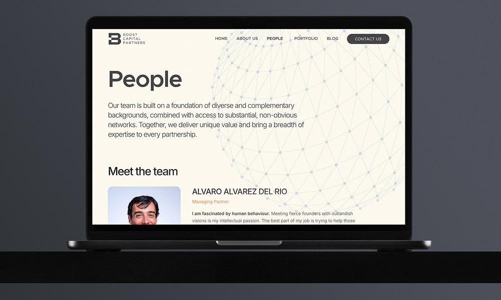
Boost Capital Partners is a London-based venture capital firm dedicated to backing early-stage startups with the potential to transform industries. What sets them apart is their human-centered approach to investing. They don’t just provide capital, they work side by side with founders, offering guidance, expertise, and access to a trusted network. This combination of funding and partnership helps entrepreneurs navigate the challenges of building a company and scale their vision into something extraordinary.
The challenge: Boost Capital Partners’ old website had an outdated design and no longer reflected their vision as a forward-looking venture capital firm. While the branding was refreshed rather than reinvented, the website itself needed to be designed entirely from scratch. We refined the existing logo, developed a new visual language with softer tones balanced by bold accents, and introduced custom illustrations to add warmth and character. The result is a digital presence that communicates professionalism and trust, while remaining approachable and human-centered, true to how Boost partners with founders.
The Design Process: Our design process began by understanding the client’s inspirations and identifying the qualities they valued most in contemporary VC websites – cohesion in color palettes, harmony in typography and imagery, and an overall sense of clarity and elegance. From there, we explored directions that would align with their vision of a complete redesign: a website that feels cool, young, tech-driven, and innovative, yet still projects professionalism and gravitas. The final design balances clean layouts, refined typography, a thoughtful use of color, and custom illustrations.
Typography: The client highlighted their preference for rounded, modern fonts that feel distinct and high-quality, avoiding the generic look of standard templates. To reflect this, we chose Metropolis as the main typeface, bringing a rounded, contemporary character to the brand. Inter was paired with it for body text and smaller headlines, ensuring clarity, readability, and balance across the website.
Color Palette: The color palette balances vibrant and muted tones to create a modern yet professional look. A bold orange paired with deep gray establishes a strong, confident foundation. Softer secondary tones of blue-gray and warm off-white bring contrast and harmony, adding warmth and approachability to the overall design.
Related Websites
-
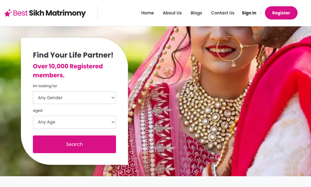
Best Sikh Matrimony
by Matrimonials
1300 -
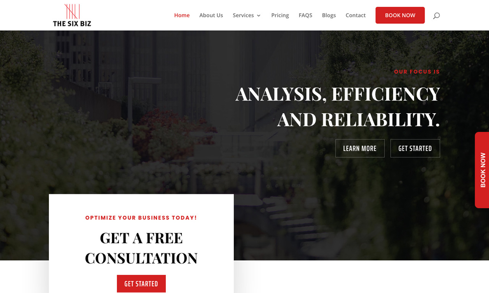
The Six Biz Inc
by The Six Biz Inc
1225 -
Creative Brook
by Creative Brook
2497