JULIE SHANNON// BRANDING / WEB DESIGN & DEVELOPMENT
by The Weather
Description
Julie Shannon has trained over 4,000 professionals in Australian government agencies and Asia-Pacific companies to enhance their board papers, briefing notes, presentations, and digital content.
Web Design: The web design reflects a clean and professional aesthetic, combining simplicity with elegance. The layout prioritizes clarity and accessibility, using ample white space, modern typography, and a cohesive color palette to create a polished and inviting user experience. The site seamlessly highlights Julie’s expertise and services while maintaining a focus on user engagement and intuitive navigation.
Typography: The branding is anchored in timeless, sophisticated typography, while the overall design embraces a minimalistic aesthetic, emphasizing negative space to create a clean and elegant visual identity.
Color Palette: Green and gold, Australia’s proclaimed national colors, served as the foundation for our design direction. Building on this heritage, we crafted a contemporary color palette that enriches these iconic hues with modern shades of green and gold, complemented by a vibrant new orange.
Logo: The logo, crafted with the IvyOra Display font, embodies elegance and modernity with its refined lines and timeless appeal. Its clean, understated design ensures a striking presence across digital and print mediums, creating a distinctive, professional, yet approachable identity.
Client's Review: “Thank you and Lenka more fully for all your work. You have been exceptional - smart, responsive and given me the most beautiful design. If you can please pass on my thanks to the designers and Kristina for her copy inspiration I would really appreciate it. I look forward to continuing to work with you as my business grows.”
Related Websites
-
EDURE PVT LTD
by Edure
219 -
SOTD
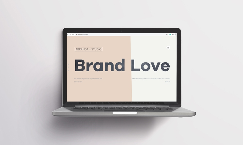
Abranda Studio
by Abranda Studio
1628 -
SOTD
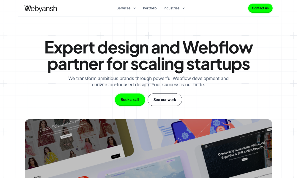
Webyansh
by Webyansh
920