MISSING MAPS // WEB DESIGN & WEB DEVELOPMENT
by The Weather
Description
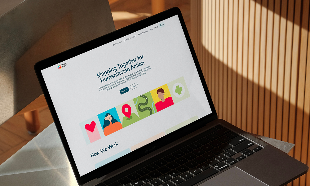
Missing Maps is an open, collaborative initiative designed to map vulnerable areas and support humanitarian organizations operating in disaster- and crisis-prone regions. Established to assist Médecins Sans Frontières (MSF) / Doctors Without Borders, the project invites volunteers worldwide to contribute data that empowers aid workers on the ground.
Web Design: A refreshed, colourful palette and updated typography strengthen the brand’s digital presence, combining visual energy with clear, functional design. We designed a set of bespoke icons, created specifically for the Missing Maps identity, to improve clarity and engagement.
Web Development: Moving beyond the constraints of a traditional CMS, this project features a custom static-first architecture built with Jekyll and hosted on GitHub Pages. By utilizing a "content-as-files" model—using structured Markdown and YAML instead of a database—the entire site functions as a reproducible system where every update is managed through a transparent, Git-based workflow. This approach replaces slow server-side rendering with a pre-rendered build pipeline, powered by GitHub Actions for automated CI/CD. While Decap CMS provides a user-friendly editorial interface, the underlying infrastructure remains database-free, significantly reducing the attack surface and eliminating maintenance overhead. We’ve layered API integrations on top of this rock-solid core, enabling dynamic data exchange with external services and supporting the collaborative nature of the project. By maintaining the codebase in a version-controlled environment, the project ensures radical transparency. Every change is openly trackable and reviewable, fostering an open-source atmosphere where community contributions are welcomed and the site remains highly portable, secure, and performant.
Typography: For Missing Maps, we selected Satoshi to establish a clear and balanced visual rhythm. Its clean, geometric forms feel contemporary while remaining neutral and highly readable, supporting both clarity and accessibility.
Color Palette: The interface follows a light theme, using white as the primary base while incorporating a range of colourful accents.
Most of the existing brand colours were retained and applied consistently to preserve visual familiarity.
Related Websites
-
SOTD
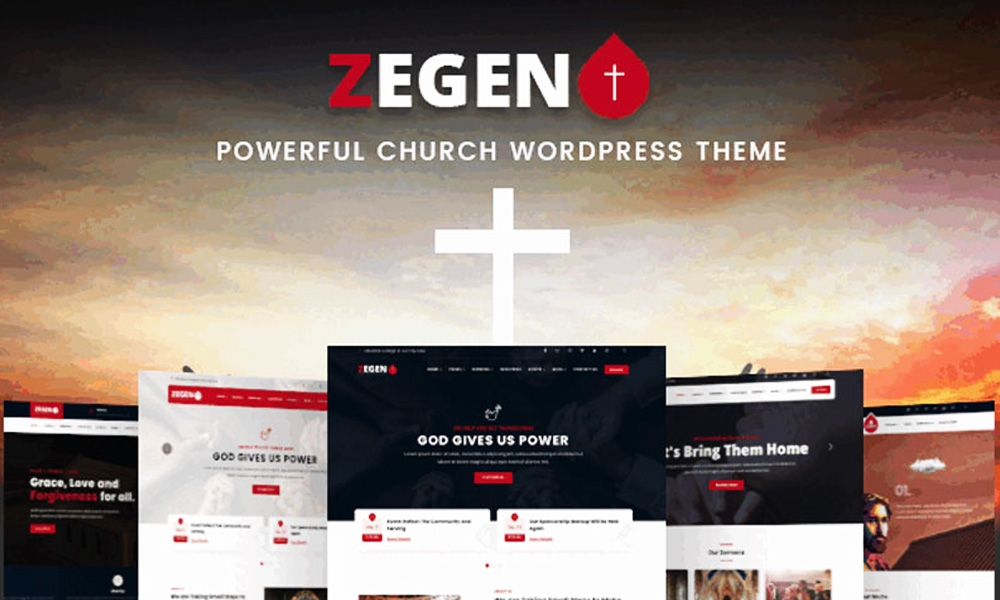
Zegen - The Ultimate Church WordPress Theme
by zozothemes
1703 -
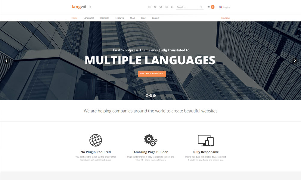
Langwitch WordPress Theme
by AIT Wordpress Themes
2447 -
SOTD
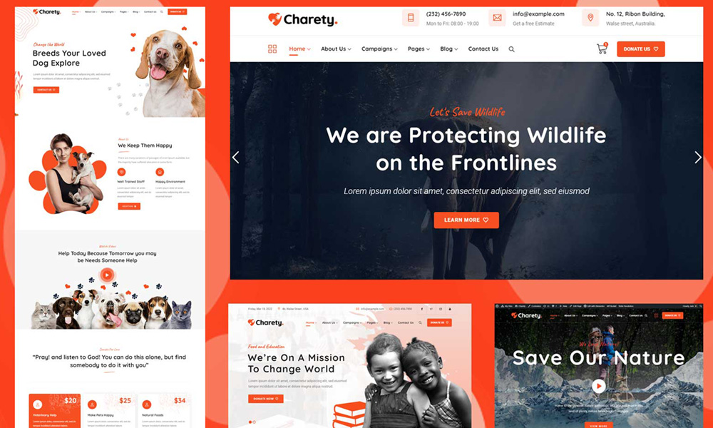
Charety - Charity & Donation WordPress Theme
by zozothemes
2270