RE/MAX
by The Weather
Description
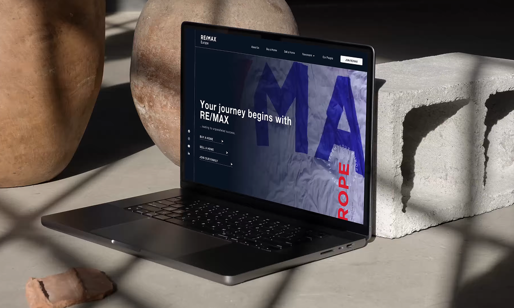
RE/MAX is one of the world’s leading real estate franchises, with a network of more than 100.000 agents spanning the globe. (It is also the operator of the world’s largest fleet of hot air balloons.)
Web Design: We created the new corporate website for RE/MAX Europe, giving it a look that is professional, paired with playful details. Our goal was to design a site that reflects RE/MAX’s identity as a forward-thinking company with a proud history and creates an immediate emotional connection with users.
Color Palette: We've carefully chosen a color scheme inspired by the established brand colors of RE/MAX. Opting for deeper shades of blues as the background, complemented by accent reds and whites, we've crafted a palette that exudes sophistication and depth. The color scheme reflects their dedication to innovation and creates a welcoming environment, inviting visitors to explore the site with ease and comfort.
Typography: In accordance with the client's font guidelines, we've implemented Helvetica for the main text on the website. Paired with the designated color palette, the font enhances the visual allure, seamlessly blending with the website's overall aesthetic.
Related Websites
-
Einnovention
by Einnovention Software Solution
801 -
Caliente Leads
by Caliente Leads
1692 -
Tree Pet Veterinary Clinic
by Tree Pet Veterinary Clinic
135