Description
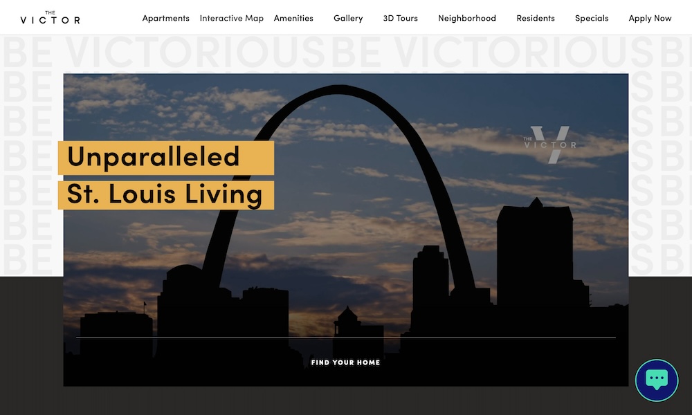
For the last few decades, a building with a footprint the size of an entire city block has been sitting primarily empty near downtown St. Louis. More than a century old, it had recently been purchased by developers looking to convert it from open warehousing space to modern, amenity-filled apartments. They asked our agency to create a name and brand identity. Inspired by the masculine and sophisticated mockups of the building’s future interiors and the new MLS soccer stadium being built just a few blocks away, we landed on The Victor as the name of the new property. The word itself inspired much of the brand visuals. The V set the foundation for a logo that embraces the building’s past and future, mixing a serif and sans serif typeface within a single character. A gridded repeat of the word “VICTORIOUS” in all caps type makes up a refreshingly simple yet bold brand pattern, and the upward slant of the V serves as a mask for photos. An understated color palette keeps the design timeless.
Related Websites
-
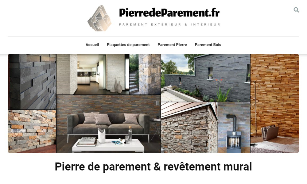
Pierre de parement
by Pierre de parement
1357 -
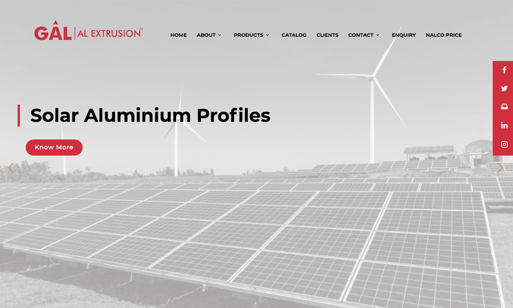
Gal Aluminium Extrusion Pvt Ltd
by Gal Aluminium Extrusion Pvt Ltd
1891 -
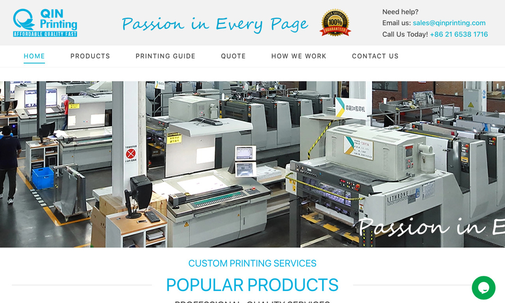
QinPrinting
by Qin Printing
1349