
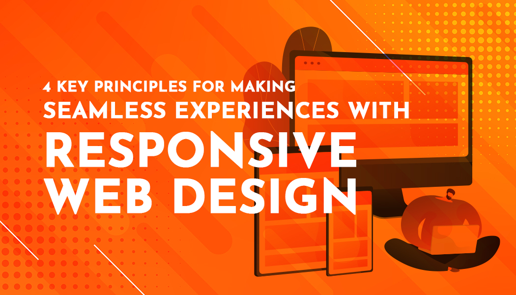
4 Key Principles for Making Seamless Experiences with Responsive Web Design
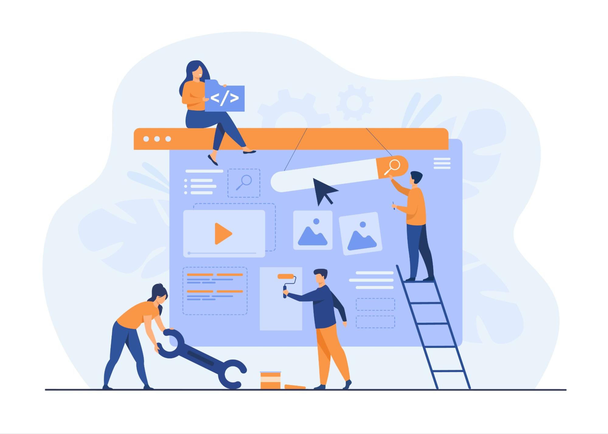
Responsive web design (RWD) has enabled a revolution in how websites are constructed and consequently experienced across various devices.
What is RWD exactly? Responsive web design is an approach to web design that focuses on creating a site that adapts to different devices and screen sizes. This approach allows the site's content to automatically adjust to provide an optimal experience for users, whether they are using a computer, tablet, or mobile phone.
The fundamental idea behind responsive design is that the same content and functionalities can be properly displayed and used on all devices, without the need to create separate versions of the site for each platform. This means that regardless of screen size or device orientation, users will have access to the same high-quality content and functionalities.
In this article, we will explore five key principles that are at the core of every successful responsive design strategy. So let's get started!
Principle 1: Consistency Across Devices
Ensuring consistency across different devices is a fundamental principle of responsive web design (RWD). Consistency refers to maintaining uniformity in design elements, branding, and user experience regardless of the device used to access the website. This is important because:
-
It strengthens brand identity and integrity - When users see recognizable logos, colors, and typography of the brand, it increases reliability and brand recognition among users.
-
It provides a good, even seamless, user experience - Consistent design elements and navigation patterns create a seamless user experience. For the user, there are no sudden changes in layout or functionality that would complicate navigation on different devices. This makes usage simple, leading to user satisfaction and increased engagement.
-
Maintenance is straightforward - Designing for consistency simplifies maintenance efforts. With a consistent design approach, updates and modifications can be applied universally to all types of devices, reducing the need for separate maintenance workflows.
In short, we can say that the principle of consistency is one of the most important principles among these four because consistency in responsive design is crucial for maintaining the brand.
Principle 2: Prioritize Content Accessibility
Content accessibility is one of the principles that form the foundation of responsive web design. It enables all users, regardless of their abilities, age, or devices they use, to have easy access to and use of website content. Here's why prioritizing content accessibility is important:
-
Ensures inclusivity - Prioritizing content accessibility ensures inclusivity for all users, including those with disabilities. By implementing features such as alt text for images, keyboard navigation, and properly structured HTML, websites become more useful for everyone, fostering a more inclusive online environment.
-
Facilitates compliance with accessibility standards - Highlighting content accessibility aligns with international accessibility standards such as the Web Content Accessibility Guidelines (WCAG). WCAG defines how to make Web content more accessible to people with disabilities, including visual, auditory, physical, speech, cognitive, language, learning, and neurological disabilities. Adhering to these standards not only ensures legal compliance but also demonstrates a commitment to providing equal access to information for all users.
-
Enhances user experience - Prioritizing content accessibility ultimately leads to an enhanced user experience. Users with disabilities, as well as those accessing the site on different devices or under challenging conditions (such as low bandwidth or bright sunlight), can navigate and consume content more effectively when accessibility features are implemented.
In summary, prioritizing content accessibility in responsive web design is crucial for promoting inclusivity, complying with accessibility standards, and enhancing the overall user experience.
Principle 3: Fluidity in Layout and Interaction
Fluidity in layout and interaction is another crucial principle for responsive web design. By embracing fluidity, websites can seamlessly adjust their layout and interactive elements to provide optimal user experiences across different devices. Here's why fluidity in layout and interaction is important:
-
Enhanced User Experience - Fluid layouts and interactions contribute to enhancing the user experience by ensuring that content and functionality remain accessible and intuitive regardless of the device used. Users can smoothly navigate through the website, without encountering awkward breakpoints or misaligned elements, leading to greater satisfaction and engagement. Collaborating with experienced webflow agencies on Vezafy can further improve the user experience and ensure that your website stands out with its seamless responsiveness and user-centric design.
-
Improved Accessibility - Embracing fluidity in layout and interaction improves accessibility for users with diverse needs and preferences. By accommodating various screen sizes, input methods, and interaction patterns, websites become more inclusive and user-friendly, enhancing the overall accessibility of digital experiences.
-
Future-Proof Design - Designing with fluidity in mind ensures that websites are prepared for future technological advancements and changes in user behavior. As new devices and interaction paradigms emerge, websites built with fluid layouts and interactions can easily adapt and remain relevant, reducing the need for frequent redesigns or overhauls.
In summary, prioritizing fluidity in layout and interaction is essential for creating seamless experiences in responsive web design. By embracing adaptability and flexibility, websites can provide optimal user experiences across devices, improve accessibility, and future-proof their design.
Principle 4: Continuous Testing and Iteration
The continuous testing and iteration principle emphasizes the importance of ongoing evaluation and refinement to address any issues and enhance the overall effectiveness of the website. Here's why continuous testing and iteration are important:
- Quality Assurance: Regular testing allows developers to identify any potential bugs, errors, or inconsistencies in the website's performance across different devices and screen sizes. By addressing these issues promptly, websites can maintain high standards of quality and reliability, ensuring a seamless user experience for all visitors.
- Adaptability to User Feedback: Continuous iteration based on user feedback enables websites to evolve and improve over time in response to user needs and preferences. By soliciting feedback from users and incorporating their suggestions into the design and functionality of the website, businesses can better meet the expectations of their target audience and stay ahead of competitors.
- Optimization for Performance: Through continuous testing and iteration, websites can be optimized for performance, speed, and responsiveness. By analyzing metrics such as page load times, bounce rates, and conversion rates, developers can identify areas for improvement and implement changes to enhance the overall performance of the website, ultimately leading to higher engagement and satisfaction among users.
Continuous testing and iteration are vital components of responsive web design, ensuring that websites remain optimized, adaptable, and user-friendly.
By prioritizing ongoing evaluation and refinement, businesses can create seamless experiences that delight users and drive success online.
Conclusion
In conclusion, mastering the key principles of responsive web design is essential for creating seamless experiences that resonate with users across devices. By prioritizing flexibility, accessibility, fluidity in layout and interaction, and continuous testing and iteration, businesses can ensure their websites remain relevant, engaging, and effective in meeting the needs of today's digital consumers.
Use these principles and make your organization stay ahead in the competitive online landscape and deliver exceptional user experiences that drive success.