5 Essentials of a High Converting Landing Page
Standing at the last leg of 2019, it calls for a lot to reflect on. For instance, the one deeply coveted secret that made it possible for online marketers to garner at least 10x more leads. That's right — a Landing page. Well, not much of a secret now since the realm of both B2B and B2C businesses at the hands of the world's best marketers have taken a solemn turn designing successful landing pages. From bloggers, entrepreneurs, big shot corporations, all swear by landing pages to boost conversion rates. According to Convertica Blog, the first step towards designing a model landing page is by taking a cue from other businesses that are doing it right. Such an approach leads one to build a framework to help design a befitting strategy for designing a successful landing page. The point is if everyone seems to be doing it wholeheartedly, there's no reason for you to stay behind. The question is, how? Fret not. Here's a look into five such essential tips to help build a high converting landing page.
A landing page is that one particular webpage where a potential visitor lands, following a click-in advertisement or an Adwords ad or any link that promotes your business. In essence, landing pages is one such heavily focussed design that caters to one single purpose-Conversion. People who fall at your landing page are those who have already bought your selling philosophy and are keen to know what more you can possibly offer and what's in it for them. Think of your landing page as the first impression that one makes in front of a visitor. So, you can't afford to go wrong with it. Let's get started with the tips:
State your USP right away
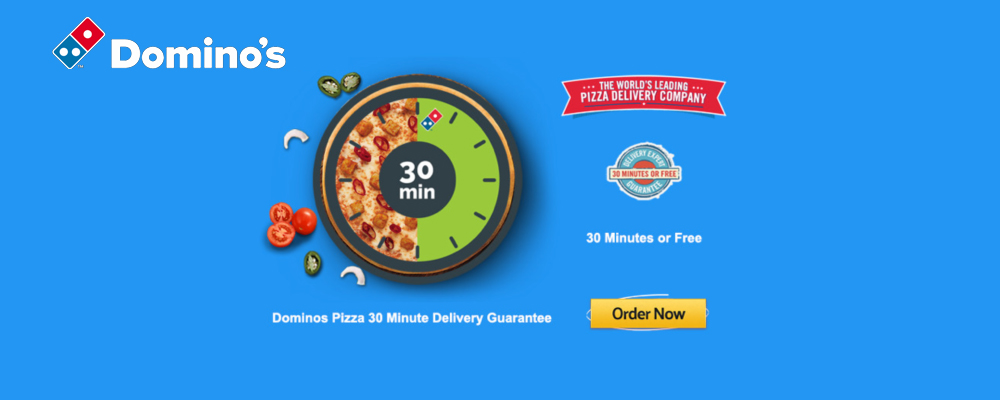
Any marketing campaign that seeks to excel needs to begin with a point of difference. What is that one thing that you can offer, and others can't? In short, your Unique Selling Proposition. Never shy away from declaring the same on your landing page. And that's not all. Break it down to the basic level and focus on the benefit that a customer or subscriber can receive from the same. Take Dominos, for instance. What's their USP? Hot pizza at your doorstep under 30 min or else you get it for free. Such well-crafted content should ride the headline of your landing page to help set the expectations right for customers. Your brand USP needs to be broken down into four essential elements across your landing page which will help illustrate your story and your primary offering in the following manner:
- Main headline– One that defines your brand and imparts identity to your product or services.
- Supporting headline-One that reinforces the idea represented by the main headline.
- Reinforcement statement –Ideate the purpose of your page and create a mid-experience for the prospect to mull over.
- Closing argument – Invariably, this is your one last shot at nailing a lead towards a successful conversion. Place your CTA right here.
The classic Hero Shot
A hero shot is nothing but a crafty visualization of an offer that helps people understand what you are offering. In a time where attention grasping window is the smallest, a hero shot is one such powerful element for a landing page aiming to convert maximum prospects. The idea of including a hero shot is to create an environ of empathy where customers can feel how and where they are facing a problem and that your product or service can offer a solution. You can either use a photo or a video to do the same. While a photograph is a classic approach, come-of-age landing pages prefer integrating small videos as a compelling element to help showcase your product. Infomercials of Slapchop are an excellent example of how one can use a video to help illustrate the benefits of a product in one's life.
Say No to Navigation
A landing page for a prospect is nothing but a beautiful trap, one that's irresistible. Hence, it should be designed in a way that would allow for your prospects to get in but quite impossible to leave without conversion. A good way to do this is to do away with navigation menu through which your visitors can escape easily. Even better, limit them to just three options to get out of the page:
- By clicking on the CTA button, like "Subscribe" or "Order Now."
- By clicking "Back."
- By clicking on the "X" option of their browser.
For brands that removed the navigation menu from their landing pages, it was found to boost conversion rate by more than 25 percent.
Social proof
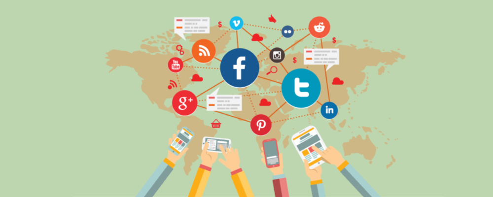
Social proof is quite convincing and engaging elements that affect conversions. When you use social signals to help broaden your product or service being owned and consumed by people, it automatically creates a steady urge for prospects into believing the benefits. With social listening becoming a serious point of consideration for small and big brands alike, there's no denying the significance of social proof and why it needs to be a part of your landing page as well. A good example of Social Proof as a part of a landing page for a brand is Basecamp, a communication tool that facilitates real-time conversations for people to stay and work on the same page.
The landing page headline mentions the number of signups the brand had over a week, further illustrated by a positive testimonial. Besides testimonials, the other preferable ways of citing social proofs include the following:
- Awards and recognitions
- Customer reviews across a brand's social media pages
- Average number of subscriptions or sales figures in a month
A bulletproof CTA
The last nail to the coffin- A CTA button is undoubtedly the highlighting point of conversion. By all means, that's the button that seals the deal, right? No matter how tactfully you have designed your landing page, without a sure-fire CTA button, nothing makes sense. To begin with, ditch words like download or submit or click here. Use smart phrases like, "Let's get started" or "Ready to Begin?" Also, write your CTA text in big fonts to garner maximum attraction. Also, pay attention to color theory and consider choosing a color that straight away complements the rest of the landing page. It helps grab the user's attention effortlessly. If you have a form that needs to be filled up, consider placing your CTA button at the very end. Pray, keep the form to a sleek one, and omit as many as fields possible. No one likes to fill a long form. Just ask for a few basics to get the guy on board.
Over to you
To create a remarkable landing page, one needs to determine the goal first. Then, optimize the same to create an unforgettable user experience right from the word "Go.” So, what are you waiting for? Now that you have got a pretty basic understanding of what needs to be included in a successful landing page, it's time to rumble.