
7 Essential Things Newbie Web Designers Must Learn Today
Do you think the title of “web designer” beside your name has a nice ring to it? Well, you have definitely set yourself up for promising career prospects by choosing web designing. However, for the new and inexperienced designers, the process of web designing can be quite overwhelming.
Maybe you have just graduated from college with all the fundamental lessons on web designing. You may have read up other blogs on web designing, and you feel you’re ready to take the plunge. Or maybe you have a few projects under your belt, and you’re looking for some valuable advice on how to proceed in the right direction.
Think we have spoken your mind? Then you might want to go over this specially curated list of things to learn as a new and inexperienced web designer.
1. Navigation is Essential
Navigation has to be the most crucial site feature. Without a seamless navigation process, the visitors will instantly be discouraged to engage with a website. Hence, you need to consider some important points when developing a navigation scheme.
It’s vital to put sufficient time and a lot of planning on a website’s navigation structure. It may seem too obvious, but you’d be surprised how many web designers take site navigation for granted.
Style, placement, technology (will it use just CSS or JavaScript?), usability, and web accessibility are a few things you need to consider when developing the navigation design.
Navigation has to be accessible without the need for client-side technologies such as Flash or JavaScript. This is because users may not install or enable them for a plethora of reasons, such as company policy or security.
2. Simplicity Can Work Wonders
It’s essential for new web designers to understand that a great website is not just one that looks visually attractive, but also one that’s user-friendly. Simple and clean web design typically eliminates the scope for any confusion.
It’s also important for new web designers to ensure each page element comes with a purpose. In this case, you need to ponder over the following questions.
- Does the design really need this?
- How the page element is related to the goal, mission, and purpose of the site?
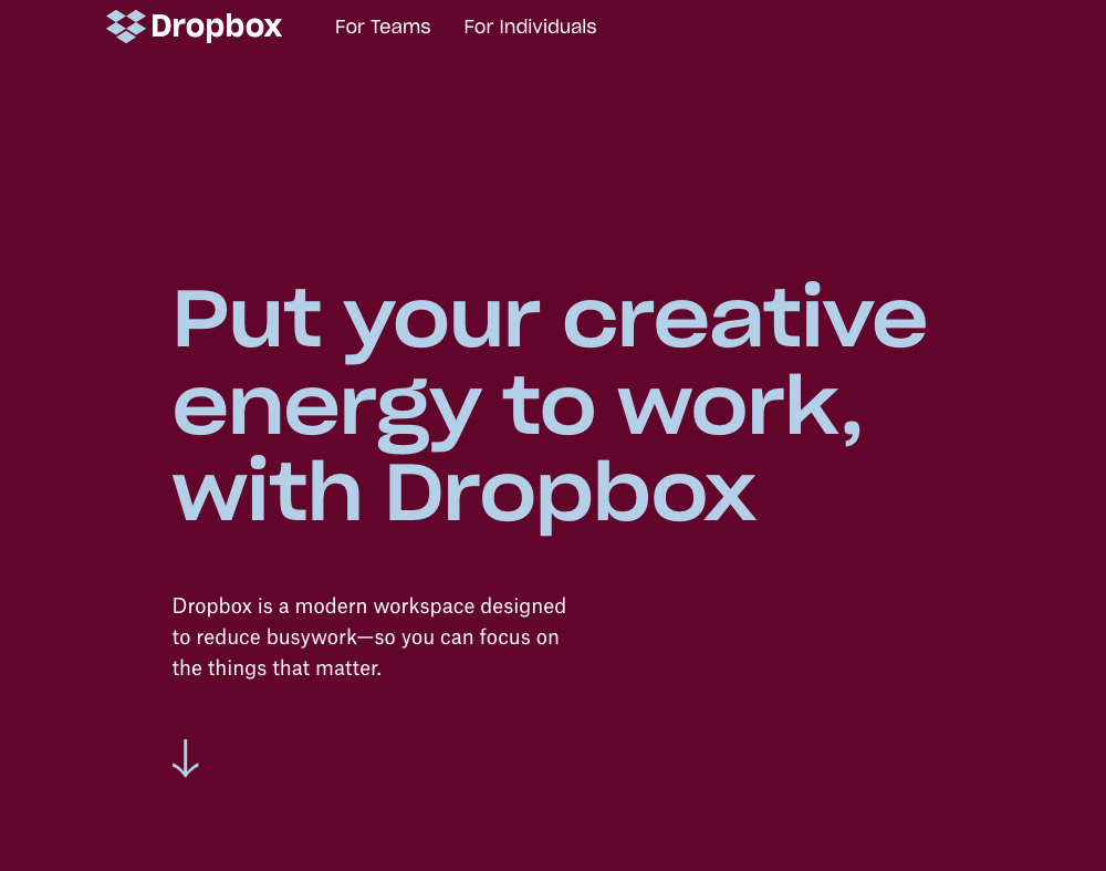
The website of Dropbox serves as a perfect example of simple website design.
3. Include The Fonts Meticulously
Even though there are thousands of fonts available, you can only use a few of them (at least until CSS3 is completely supported by major browsers). It’s best to stick to web-safe fonts. Alternatively, you can also consider a progressively-enhanced web design that leverages sIFR or Cufon.
Maintaining consistency with the font is also important. You need to ensure that headings are different from paragraph text. Use white space, font-size, and letter-spacing properties to make the content pleasant to read.
Also, try to keep font sizes at and above 12px, particularly for paragraph text. While many people may have no difficulty reading small texts, you must be considerate about elder users and people with some vision impairment.
4. Knowledge of Coding Will Come Handy
With the popularity of WYSIWYG( What You See Is What You Get) editors, designing a website has become as simple as counting 1-2-3. However, most of these editors include code junk unnecessarily. This leads to a poorly designed HTML structure that is harder to maintain and update. Moreover, this causes your file sizes to bloat.
Writing the code yourself allows you to present clean, crisp, and terse code that’s a pleasure to read and maintain; code that you would be happy to call your own.
Knowing how to use a WYSIWYG or an IDE (Integrated Development Environment) with a visual preview doesn’t excuse you from learning CSS and HTML. You have to become acquainted with them in order to create effective, semantic, and highly-optimized web designs.
5. Play With Colours The Right Way
Just like fonts, you must also consider the usage of colours.
You need to think about the colour contrast of background and foreground for readability and visually-impaired users. For example, black text on a white background comes with a high-contrast, while green text on a red background will make you strain your eyes.
Some colour combinations look good only when the colour is implemented in the foreground colour instead of the background. For instance, take dark blue texts on a pink background, as opposed to pink text on a blue background. You are playing with the same colour schemes, but both combinations offer different levels of readability and comfort. It’s essential not only to have a great colour combination but also to use it in the right sections of the page.
6. People Are Impatient, But You Need to Still Draw Them In
People on an average spare only a few seconds before turning away from the website you’ve designed. Hence, you as a web designer have to find a way for attracting users within those precious seconds.
You must know not many visitors will scroll down to check the contents of the page if what they the first fold of the page isn’t appealing enough. Remember to keep the crucial elements on the top where they are easily visible. But you must not overcrowd the top half of the page as that might put the users off from reading further down the page.
Perceive the top half of a website to be the selling point. Take a cue from salesmen, and make people buy into the idea that they want to see what else is on the site.

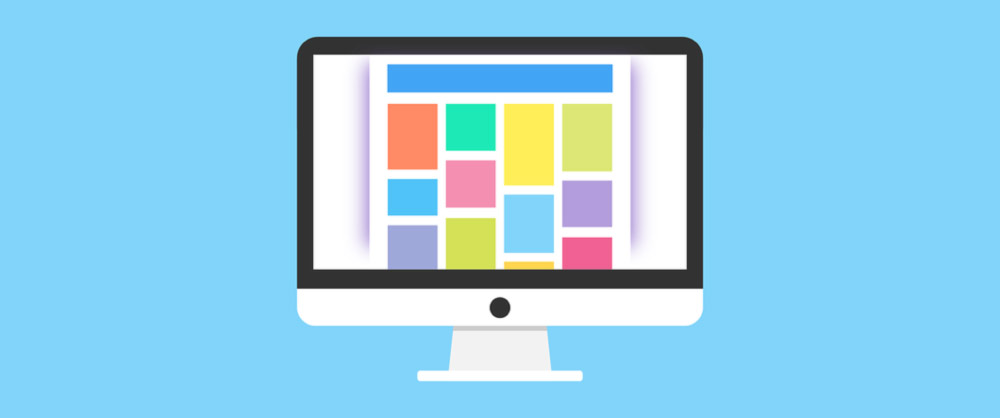
7. Optimize Web Graphics For Improved Page Load Times
As a newbie, you should learn to optimize your web graphics by choosing the appropriate format and ensuring that it’s as small as possible. Particularly with the emergence of mobile technologies which don’t necessarily have broadband-like speeds, having slow page load times owing to image file sizes can be a major turn off for the users. Imagine you’re designing an website to promote your paraphrasing tool, you need to keep the urgency of the students in mind.
Here’s a proper rule of thumb for selecting the right file format: Images that have solid colors are best saved as GIFs and PNGs, while images with continuous colour (such as photographs) are best saved as JPGs.
You will significantly reduce page response times of a web page by limiting the number of images you use, being smart about incorporating images and minimizing file size as best as you can.
Yay! You've made it this far into the post. Hopefully, now you will have the confidence to put your design skills to good use. To wind things up, here's a quick recap for you to go over.
The Takeaway
As an inexperienced web designer, following some practices will help you to eliminate any kind of confusion while designing a website. Those practices are-
- Navigation is essential
- Simple and clear web design for the win
- Pay attention to font size and style
- Carefully choose the colour schemes
- Coding is necessary
- Draw the visitors in with the right design
- Improve page load time