
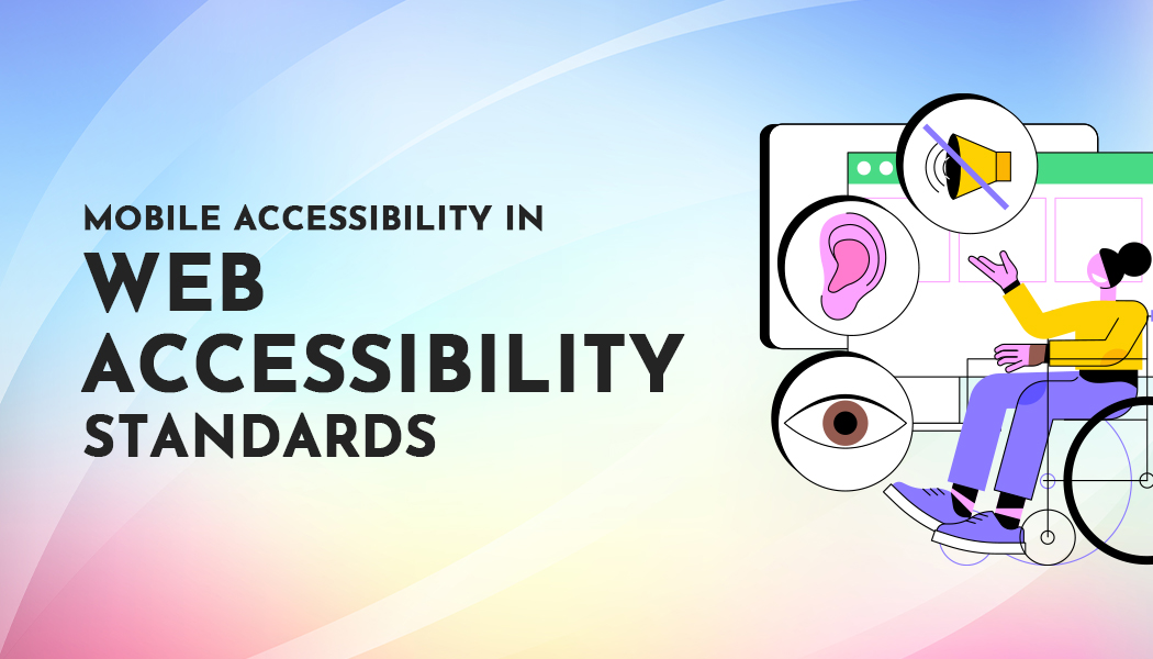
Focus on Mobile Accessibility in Web Accessibility Standards: a practical 2025 playbook
Smartphones are now the first screen for most people. That means your site is judged, instantly, by how easy it is to use on a small touch display, one-handed, in bright light, on the go, and with assistive tech turned on. Suppose you want dependable organic traffic and happy users. In that case, you need a Focus On Mobile Accessibility in Web Accessibility Standards across design, content, and code, not as an add-on, but as baseline quality.
Below is a specialized, plain-spoken guide you can hand to designers, writers, and developers. It translates The Latest Web Accessibility Standards into mobile-first actions you can ship this sprint, with extra notes on what changed in WCAG 2.2 and why it matters on phones and tablets.
What does mobile accessibility mean in practice?
Mobile accessibility means everyone can use your site or app on a phone, comfortably and reliably, regardless of vision, motor, hearing, or cognitive differences. In practice, that translates to:
-
Thumb-friendly targets (no precise tapping required).
-
Readable text that reflows without sideways scrolling.
-
Clear focus so keyboard, switch, and screen reader users never lose their place.
-
No forced device orientation (portrait/landscape both work).
-
Gestures with alternatives (no “pinch to use” dead ends).
-
Low-effort forms that avoid repeated typing and tricky CAPTCHAs.
The goal is simple: remove friction. The path is standards-driven.
Standards snapshot: what’s current (and what changed)
The current reference is WCAG 2.2 at Levels A and AA for most teams. WCAG 2.2 adds nine new success criteria, several of which are directly relevant to mobile, including:
-
2.4.11/2.4.12 Focus Not Obscured (AA/AAA) – focused items can’t be covered up by sticky headers, cookie banners, or popovers.
-
2.4.13 Focus Appearance (AAA) – stronger, clearer focus styling.
-
2.5.7 Dragging Movements (AA) – provide an option besides drag for core actions.
-
2.5.8 Target Size (Minimum) (AA) – tap targets must be at least 24×24 CSS px or spaced so large “virtual circles” don’t collide.
-
3.2.6 Consistent Help (A) and 3.3.7 Redundant Entry (A) – reduce cognitive load in flows; crucial on small screens.
-
3.3.8/3.3.9 Accessible Authentication (AA/AAA) – logins must not rely on memory tests or complex puzzles.
WCAG 2.2 also formally removed 4.1.1 Parsing and provides clarifications that help international sites. For mobile apps, W3C now publishes guidance mapping WCAG 2.2 to native and hybrid apps, useful if your team ships web + app.
Keep an internal style note pointing to “The Latest Web Accessibility Standards” so editors and engineers use shared language when planning new work.
The mobile criteria you can’t ignore, in plain English
Treat this as a build checklist and definition of “done.”
-
Orientation
Don’t lock to portrait or landscape unless necessary. Let users choose. -
Reflow
Content must reflow at 320 CSS px width without forcing two-directional scrolling. That means fluid layouts, proper line wrapping, and avoiding fixed-width containers. -
Non-Text Contrast
Controls, icons, and input borders need enough contrast against their backgrounds; color alone can’t carry meaning. -
Text Spacing
If a user increases line height, paragraph, letter, or word spacing to standard values, nothing should break, no overlapping buttons or clipped labels. -
Content on Hover or Focus
Tooltips and popovers must be dismissible, hover-independent on touch, and non-obscuring. -
Character Key Shortcuts
Don’t trigger actions with single-key shortcuts by default. Make them off by default or remappable. -
Pointer Gestures
If a feature uses multi-finger or path gestures (pinch, drag), provide a simple single-tap or button alternative. -
Pointer Cancellation
Avoid actions on “pointer down.” Confirm on “up,” or give a clear undo. -
Label in Name
The visible label matches the accessible name. If a button says “Delete,” the accessible name should include “Delete.” -
Motion Actuation
If shaking or tilting acts are provided, provide a control to do the same without motion and let users disable motion triggers. -
Focus Not Obscured
When an element gets focus, it must not be hidden behind sticky UI or popups. Test with external keyboards and screen readers on phones. -
Dragging Movements
Provide an alternative to drag, for example, up/down arrows, “Move item” buttons, or long-press menus. -
Target Size – Minimum
Each tap target is ≥ 24×24 CSS px, or you provide sufficient spacing or an equivalent larger control. This one alone removes tons of mobile frustration. -
Consistent Help
If your flow offers help (chat, phone, FAQ), keep it in a consistent location across steps. -
Redundant Entry
Don’t make users retype data you already have. Pull it forward, and let them confirm. -
Accessible Authentication
Logins must avoid memory puzzles or pure “find the object in an image” tests. Offer copy-paste-friendly codes, password managers, or device-level auth.
Design rules for thumbs, glare, and one-hand use
These patterns map directly to standards and feel great on phones:
-
Hit targets: Start at 44–48 px visual size when space allows. The standard minimum is 24×24 CSS px, but bigger is better. Maintain at least 8–12 px safe spacing between separate targets to reduce accidental taps.
-
Readable defaults: 16 px base font, 1.5 line height, generous paragraph spacing. Confirm nothing breaks when users increase text spacing per SC 1.4.12.
-
No text in images: Use real text with proper contrast so it reflows and can be read by screen readers.
-
Avoid fixed headers that eat vertical space or obscure focus. If you must use them, reserve safe areas and programmatically shift content.
-
Gesture alternatives: Always provide a button or menu option for actions that would otherwise require drag, pinch, or long press.
-
Motion settings: Respect OS settings like “Reduce Motion,” “Bold Text,” and “Increase Contrast.”
-
Orientation-friendly: Don’t force portrait only. Product photos, tables, code, and timelines often read better in landscape.
Form flows: where most mobile friction hides
Forms are the make-or-break moment on mobile. Tighten them with these standards-aligned moves:
-
Labels, not placeholders. Place labels above fields; keep them visible when typing.
-
Field purpose: Use correct input types (email, tel, number) and autocomplete tokens so the right keyboard appears and autofill works.
-
Ditch repeated typing (Redundant Entry). Carry over known data from step 1 to step 3, and show it for confirmation instead of asking again.
-
Clear errors: Explain what went wrong, how to fix it, and move focus to the message.
-
Easy auth: Favor email-magic links, copy-paste-friendly codes, or platform passkeys over decipher-the-tiny-picture CAPTCHAs (Accessible Authentication).
-
Consistent help: Keep help options (FAQ, chat) in the same location on each step to reduce cognitive load.
Focus states that work on touch + keyboard
On phones, users still tab with external keyboards or switch devices, and screen readers show “virtual focus.” Make it obvious:
-
Visible, thick outlines around focused elements (not just color).
-
No obstruction: Skip patterns where sticky bars cover the focused control.
-
Avoid auto-focus traps: Don’t jump focus unexpectedly when content updates.
-
Tap & focus parity: If tapping opens a popover, tabbing should do the same, and focus should move into it. When dismissed, return focus to where it started.
A quick CSS starting point:
:focus-visible {
  outline: 3px solid currentColor;
  outline-offset: 3px;
}
(Adjust color via a token that meets contrast with the surrounding UI.)
Testing plan: fast, realistic, repeatable
Device matrix (minimum):
-
iPhone (latest iOS) + VoiceOver
-
Android (latest) + TalkBack
-
Small screen (≤ 360×640 dp) and large phone/phablet
-
External keyboard on at least one device
Scenarios to run each release:
-
Keyboard only: Can you reach every control? Is the focus visible? Nothing gets covered?
-
Screen reader: Headings announce, controls have names that match visible labels, dialogs trap focus correctly, and reading order is logical.
-
Zoom & reflow: 200% zoom and narrow widths, no horizontal scroll for text blocks.
-
Spacing stress test: Apply the SC 1.4.12 spacing presets and confirm nothing overlaps or breaks.
-
Gesture alternatives: Drag, pinch, long press, all must have simple taps or buttons.
-
Target check: Spot-check common controls against the 24×24 CSS px rule or spacing exception.
Tip: Write these as automated checks where you can (e.g., lint for tap target sizes in design tokens; unit tests to keep focus from landing under sticky headers; visual regression for focus outlines).
Common mobile anti-patterns to retire
-
Tiny icon-only buttons with 16 px hit areas.
-
Hidden labels that rely on placeholders.
-
Carousel controls that require precise swipes or long drags without arrows or “next” buttons.
-
Sticky cookie banners that cover focused items.
-
Single-key shortcuts that fire actions while a user types in a field.
-
CAPTCHAs that require solving distorted text or picking tiny objects from busy photos.
Why does this help SEO and conversions (beyond compliance)
-
Better CWV + engagement: Clean, reflow-friendly layouts are usually lighter and less jittery, lifting Core Web Vitals and reducing bounce.
-
Higher task completion: Bigger targets and clearer focus speed up critical flows (checkout, lead forms) and cut error rates.
-
Risk reduction: Aligning with Focus On Mobile Accessibility in Web Accessibility Standards lowers legal exposure in markets where mobile users dominate.
Wrap-up: Focus On Mobile Accessibility
A Focus On Mobile Accessibility in Web Accessibility Standards is not about chasing checklists, it’s about building a site that works the first time for the widest range of people on the device they use. If you adopt the rules above, connect your UI tokens to target sizes and focus styles, and bake the testing plan into releases, you’ll meet The Latest Web Accessibility Standards while also improving speed, conversions, and trust.