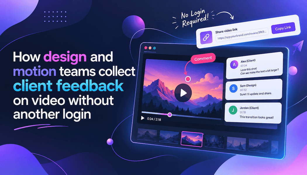
How design and motion teams collect client feedback on video without another login
Award-winning sites and product films share a quiet failure mode. The work looks sharp in the studio. Then it leaves the studio. A client watches on a laptop in a café, types “can we try something warmer around 0:18?”, and the designer spends the next afternoon guessing which cut, which layer, and which version of “warmer” they meant.
That is not a taste problem. It is a review design problem.
Design and motion teams already sweat composition, type, and motion. The last mile—getting a stakeholder to say yes—still happens in tools that were never built for looking at a moving picture. Email buries the file. Slack splits the conversation. A shared Drive folder has five exports named final_v3_REAL. Nobody is trying to be difficult. The system invites ambiguity.
The real cost of “make it pop”
A typical agency round looks like this.
A motion designer exports an MP4, drops it in a thread, and asks for notes by Thursday. Three people reply. One watches on mute. One watches at 1.5x. One never opens it and comments from memory of the last deck. The notes contradict each other. The designer implements the loudest comment. The next round starts with “that’s not what I meant.”
You can measure the damage in hours, but the worse damage is trust. Clients start to believe the team does not listen. Designers start to believe clients cannot decide. Both are usually wrong. The feedback never sat on the same frame as the picture.
If you design interfaces for a living, you already know this pattern. A usability note that is not attached to a screen is folklore. Video is the same, only faster. Twenty-four or twenty-five pictures a second. A comment that is “somewhere in the intro” is a bug report without a URL.
Why another login kills the review
Studios often respond by buying a review platform, then sending the client an invite. The client is a brand manager, a founder, or a lawyer. They do not want a fourth SaaS password. They delay. They ask you to “just send the file.” You are back in email.
The approval path that actually gets used is the one with the fewest new accounts. Guest review links matter more than feature lists for this audience. The client should click, watch, and leave a note. If they must create a profile before they can type, many will not type.
That is also why “please leave comments in the YouTube draft” fails in professional work. Public or unlisted hosts are for distribution. They are not a place to draw on a frame, compare version B to version A, or keep the conversation inside the project instead of a personal inbox.
Pin the note to the frame
The smallest useful unit of video feedback is not a paragraph. It is a timestamp plus a sentence.
“At 00:18, the logo lockup is 8 frames late relative to the bass hit. Pull it earlier, do not recut the whole sting.”
That note can be executed. “The open feels off” cannot.
A practical video feedback tool is a review surface: upload or drop a cut, share a link, collect timestamped comments, and keep drawings on the picture instead of in a side chat. Kreatli is built around that loop so agencies and in-house teams are not running Slack as a video player.
Use it like a critique, not like a dump. One owner for the round. A due time. A rule that every note must include a time or a drawing. If a stakeholder cannot point to a moment, they are describing a feeling. Feelings are allowed—label them as direction, not as a change request.
When the round closes, the editor should be able to walk the comment list in timeline order. That is the difference between one revision pass and three.
Draw when words fail
Designers already think in marks. We circle a bad kerning pair. We strike a margin. We sketch a crop. Video deserves the same muscle.
Type is slow when the issue is spatial. “The lower third covers the product” is clearer as a box on the frame. “The eye line is wrong in this interview” is clearer as an arrow. A video annotator exists for that: draw on the picture, keep the mark with the timecode, and stop translating pictures into adjectives.
This is especially useful for:
- Brand and packaging films where a logo clear-space rule is visual, not verbal
- UI motion where a control is a few pixels off and nobody can describe which
- Color and grade notes that are easier to circle than to name in hex
- Legal and compliance reviews where a face, a plate, or a claim must be flagged in place
Clients who will not write a long note will still scribble. Meet them there.
A loop you can run this week
You do not need to rebuild the studio. You need a default.
- One file of truth. The cut that is in review is named and dated. Old exports stay in an archive folder, not in the client thread.
- One link. Send a guest review link, not an attachment, unless the client has a security process that forbids streaming. If they must download, they will comment on a local copy you cannot see.
- One round owner. Someone on your side resolves comments, asks follow-ups, and marks what is in or out of scope.
- One visual language. Timecode for timing. Drawings for layout. Written notes for story and tone. Do not mix all three into a single vague paragraph.
- One close. When the client approves, capture it on the same asset. A thumbs-up in Slack is not an approval trail when someone asks six months later who signed off.
A note on awards and case-study films: the cut you submit to a gallery is not the cut you show a client in week two. Do not mix those audiences in one link. The client round is about brand, product, and legal. The awards round is about craft. If a founder comments on a festival cut, you will “fix” things that were never meant for them. Separate links, separate owners.
If you work across time zones, set the review window in the client’s calendar, not yours. A 24-hour window with a pinned player beats an open-ended “whenever you have a moment,” which is how notes arrive after the motion designer has already started the next job.
Design work is judged on the site, the film, the campaign. Review design is judged on whether the next version is obviously the one they asked for. Pin the note. Skip the extra login. Close the round while the picture is still on screen.