
How to Design Hero Images That Survive Every Responsive Crop
A hero image can look balanced in a wide desktop mockup and fail the moment the layout becomes narrow. The subject shifts too close to an edge, a face disappears behind a headline, or the mobile crop removes the detail that made the image meaningful in the first place. These problems are easy to miss when image selection happens on a large artboard instead of inside the responsive layout where the asset will actually live.
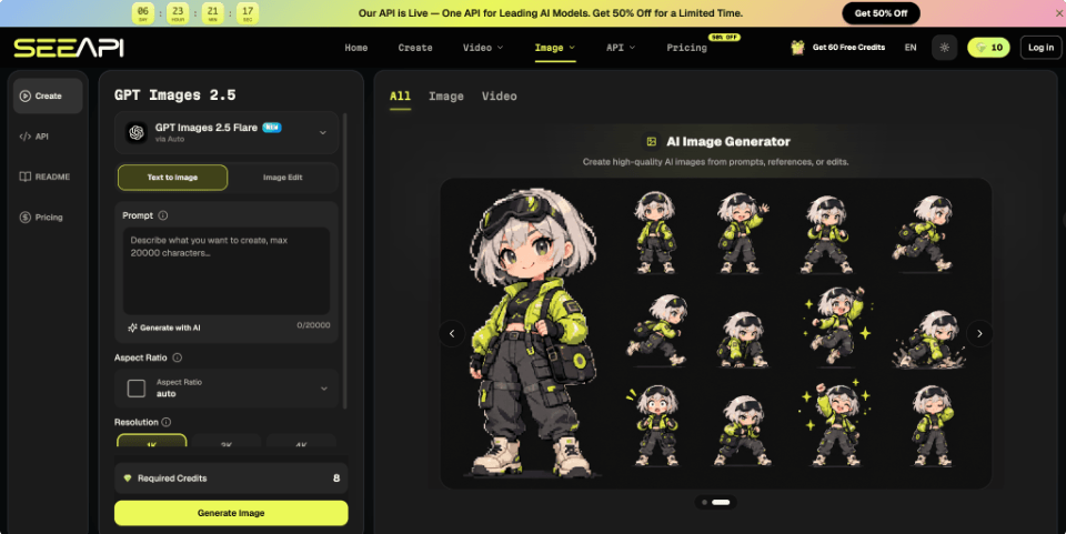
The usual fix is to resize the same file repeatedly, but resizing does not solve composition. A better responsive hero image design process starts by deciding what must remain visible, where copy needs breathing room, and how much visual information can disappear without changing the message. When an approved source image is close but cannot support another frame, ChatGPT Images 2.5 API can be explored as one reference-led editing route for revising composition while keeping important source details in view. The rest of the workflow is still a design problem: define safe zones, test realistic crops, and decide when one master image is no longer enough.
Start With the Crop, Not the Canvas
List the actual placements before adjusting the artwork. A homepage hero might appear as a wide desktop banner, a shallower tablet block, and a tall mobile section with text stacked above or over the image. Create simple frames for each placement and insert the untouched source image using the crop behavior the site will use.
Then mark what fails. Do not write “mobile looks awkward.” Identify the cause: the product is cut at the handle, the model’s gaze points outside the frame, the headline overlaps a bright area, or the focal object becomes too small. This creates a useful correction brief.
Separate content into three categories: essential, supportive, and disposable. Essential elements must survive every crop. Supportive elements can move or shrink. Disposable background detail can disappear. That distinction prevents teams from protecting every pixel and producing a composition that cannot adapt.
Build One Composition Around Safe Zones
A responsive hero becomes easier to manage when the composition has a protected center of meaning rather than a single fixed canvas. Four checks make that idea testable.
1. Define the Non-Negotiable Focal Point
Choose one element that tells the visual story when the frame becomes tight. For a product page, that may be the product silhouette and one recognizable detail. For a portrait-led campaign, it may be the face and upper-body gesture. For an editorial illustration, it may be the relationship between two objects. Draw a safe box around that focal area and keep it away from the narrowest crop edges.
Test the image at mobile size. If the intended focus is difficult to identify quickly, the composition is carrying too many competing elements. Reduce secondary detail before trying to fix the problem with stronger contrast or a tighter crop.
2. Reserve Space for Copy and Controls
Hero art rarely appears alone. Navigation, headline text, buttons, or badges may occupy the same visual field. Add them to the test frame early. A quiet area that looks unnecessary in the artwork may be what keeps the finished page readable.
Imagine a footwear campaign with the shoe right of center and soft texture on the left. Desktop copy fits naturally in that open area. On mobile, centering the same shoe may remove stable text space. A better treatment might move the shoe lower, simplify the background, and place copy above the image.
3. Test Portrait and Landscape Crops Early
Do not approve the master after seeing only one wide version. Put the same candidate into at least one landscape and one portrait frame before sign-off, then inspect both at realistic display sizes.
Watch for three failure signals: the focal point touches the crop edge, negative space collapses around copy, or the meaning changes because a supporting element disappears. If any signal appears repeatedly, revise the composition before polishing details.
4. Repair the Frame Without Replacing the Subject
When layout tests reveal a framing problem rather than a concept problem, work from the approved image instead of rebuilding the scene. With Image 2.5 API, a designer can provide the source image, describe the target placement, name subject details that must remain unchanged, and request a focused edit to framing or surrounding space. Its public workflow supports reference images and instructions that separate the intended change from details that should stay consistent.
Compare the result with the original at the actual interface size. Check subject proportions, recognizable details, edge quality, lighting continuity, and usable space around text. If the new frame fixes the crop but changes the subject’s identity, it has failed the brief.
Test the Image Inside Real Layouts
Review the hero in the page, not in an image viewer. Build accurate frames that include navigation height, headline width, button placement, and real container dimensions. Inspect the breakpoints that matter to the project instead of dragging the browser randomly and reacting to every intermediate width.
Pay attention to reading order. If the eye goes to a decorative object before the headline or main subject, reduce contrast, simplify the scene, or change the crop. If the background becomes too dense behind text, first test whether the composition can create cleaner negative space rather than automatically adding an overlay.
Also test a longer headline. Localization, promotions, or later content updates may add another line. A hero that works only with one exact sentence is fragile, so leaves enough tolerance for reasonable copy changes.
Know When Separate Assets Are Better
One responsive source is useful only while the visual idea survives. Create a separate mobile or tablet asset when the narrow crop destroys the focal relationship, when important text must be embedded in the artwork, or when the subject needs a substantially different camera distance to remain readable. These are composition changes, not simple crop adjustments.
Do not create separate files merely because a background detail shifts or the desktop version contains more empty space. Extra assets increase review, export, naming, implementation, and maintenance work. Keep one source when the focal point, message, subject scale, and text-safe area remain stable across placements.
Compare the smallest and largest frames side by side. If both communicate the same idea before explanatory copy is read, one responsive family is probably enough. If mobile hides the main detail or requires awkward repositioning to remain understandable, treat it as a distinct art-direction task.
Make Responsive Art Direction a Habit
Responsive hero image design works best when crop testing happens before final polish. Start with placement frames, classify visual elements by importance, protect one focal area, reserve space for interface content, and test both portrait and landscape conditions before approving the master. When an image fails, diagnose whether the problem comes from cropping, subject scale, text collision, or the composition itself. That diagnosis tells you whether to reframe, simplify, or create a separate asset.
Over time, these checks can become part of the design system rather than an emergency task at launch. Record safe-zone guidance, preferred subject positions, common breakpoint behaviors, and examples of crops that should be rejected. Future campaigns then begin with known constraints instead of rediscovering the same problems. The result is not a rigid image template, but a repeatable way to preserve visual meaning while layouts change around it.