
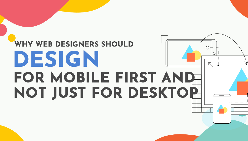
Why Web Designers Should Design for Mobile First and Not Just for Desktop
The world has changed. Mobile devices are now the most common gateway to the internet and yet many websites are still conceived on wide desktop screens. Designing for the large canvas of a laptop or desktop may feel comfortable to creators with powerful machines and high resolutions. It may feel safe and familiar. It may even feel creative. But this desktop first mindset misses where the vast majority of users begin. Websites designed primarily for desktop risk appearing cluttered cramped or frustrating when squeezed down to a phone screen. Designers who want their work to feel seamless to real users understand that mobile deserves to be the starting point not the afterthought.
The biggest reason is simple. Most people browse the web from their phones. In many countries the majority of internet access happens on mobile devices. Traffic from smaller screens is dominant. Designs that are not built with that reality in mind end up delivering a diminished experience. Even if a design looks flawless on a laptop local testers visiting it on their iPhones or Android devices may find buttons too small text hard to read or interactions awkward. This leads to frustration and early exits. When designing the mobile experience first the interface is naturally clear concise and usable at scale. Small screens force the designer to focus on what matters. The priorities become content readability navigation clarity and thumb friendly interactions. These core elements form the foundation for a better user experience across all devices.
Designing mobile first forces clarity and discipline. Without the luxury of expansive layouts designers must capture the essence of the user journey. Every pixel must serve purpose. When design begins on a large screen it is easy to add elements to fill space to layer decoration to introduce complexity. With mobile first the challenge is reversed. Designers must strip back to the essentials. They must refine content flow and interactions for speed and clarity. That mindset then scales upwards naturally. Designers layer additional features enhancements and visual complexity only after the core experience functions flawlessly in a mobile context. The result is not minimalism for its own sake. It is design that centers on what users truly need rather than what designers think looks cool.
Beyond user experience mobile first approaches support performance and search engine visibility. Leaner layouts lighter images simplified code and faster load times all stem from mobile conscious design. Sites that load quickly on slower mobile networks not only retain users but also fare better in search engine rankings. Search platforms now use mobile first indexing meaning the mobile version of a site determines its position in search results. A desktop oriented site with a clumsy mobile version loses visibility. The competitive advantage favors websites built from the ground up to perform perfectly on phones.
Designing mobile first also anticipates future shifts in how people use the web. Mobile devices are not static. Screen dimensions vary widely from compact phones to foldable screens to compact tablets. Mobile first thinking means building adaptable layouts that respond elegantly across contexts. Then when users visit from a large monitor or in landscape orientation the site scales up fluidly. Design driven by small screen constraints adapts more gracefully than desktop designs that must be pared down. The mobile first approach yields responsive systems that are both flexible and resilient without sacrificing usability.
There is also an economy to mobile first design. Starting small avoids wasted effort. Designing for desktop first can mask problems that only emerge on mobile. Designers may invest time building complex features that assume desktop interactions. Then when adapting to mobile they must undo that work and rebuild controls, spacing, and navigation. Starting with mobile forces essential tasks to be identified early. It helps prioritize what matters most and prevents unnecessary complexity. This tends to result in faster development cycles and more agile iterations informed by real user interaction.
Designing mobile first does not mean ignoring aesthetics. Thoughtful color typography and graphic treatments still flourish. But designers learn to be surgical in how they use visual elements. The result often feels cleaner stronger and more intentional. When expanded for desktop these visuals shine even more because they are grounded in functional clarity. The experience remains consistent across contexts because every design decision was driven by constraints and usability rather than device size.
One challenge for designers is the familiarity of their own tools. It is difficult to shift mindset away from the comfort of a large monitor with everything visible simultaneously. But real users do not have that luxury. They interact with half obscured gestures small tap targets unreliable connections and limited attention spans. Good design meets people where they are not where creators are. Embracing mobile first means stepping into the shoes of the majority of users and crafting experiences that feel natural and seamless.
Real-world examples demonstrate the effectiveness of mobile first approaches. When platforms build from a mobile conscious foundation they unlock higher engagement retention and satisfaction. Every time a user visits and taps through a site without frustration they reinforce trust. The design feels personally engineered rather than retrofitted. That feeling is subtle and powerful. It is what separates a pleasant online experience from a memorable one.
Mobile first design also aligns with inclusive principles. Smaller screens amplify accessibility issues. Text that looks legible on large screens can become unreadable on mobile. Tap areas need to be large enough for thumbs. Interactive patterns must account for unsteady connections and variable contexts like outdoor use or one handed scrolling. Starting mobile first compels designers to address these needs. Then when expanding to desktop the experience remains inclusive and accessible by default rather than patched later as an afterthought.
Another motivating factor is that mobile first design supports testing and feedback more efficiently. Designers can prototype an experience on mobile and observe user flows rapidly. Even small changes can be evaluated quickly on real devices. When the foundation is solid designers feel confident expanding features for larger screens. Mobile first thinking leads to iterative design cycles that continually improve based on user data. It encourages experimentation rather than static output.
It is true that mobile first can create challenges when scaling up. Designers must thoughtfully introduce layout adjustments, additional features, and side navigation without overwhelming the structure. But if the mobile core experience is well defined the transition feels natural. The added content appears as enhancements not distractions. The mobile first foundation protects against sprawl and preserves focus, even on a 27 inch display.
Beyond usability and performance mobile first advances business goals. Mobile friendly design fosters engagement on the devices people use most. That leads to better conversions newsletter signups purchases or other desired actions. A brand that works seamlessly on mobile demonstrates understanding of its audience’s needs. Viewers feel considered and respected because the experience matches their context not the designer’s.
Ultimately designing mobile first is an attitude rather than a technique. It rewires how digital experiences are conceived. It prioritizes clarity performance and accessibility from the first sketch and the first wireframe. It respects the conditions under which most people interact with the web. It paves the way for scalable experiences that work across all devices rather than fractured versions. Designers who adopt mobile first do not limit creativity they refine it. They learn to express ideas clearly within constraints not despite them.
In the end designing mobile first is not settling for less. It is designing for real life. It is honoring context. It is building websites that reach wider audiences more effectively. When designers start mobile first they build smarter faster and with deeper impact. The result is not a compromise but a stronger design foundation that scales beautifully. And that matters deeply in a world where mobile is not occasional but fundamental to how people connect, consume, and interact online.